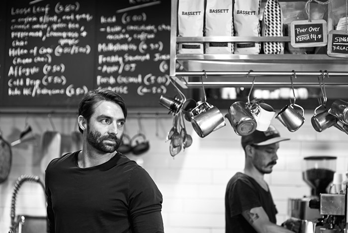
Paul Bassett, former World Barista Champion, is the visionary behind Bassett Espresso. From the moment Paul presented us with the challenge to reinvigorate his existing coffee brand, we recognised what was to be a truly rewarding collaboration. Bassett Espresso is a reflection of Paul’s personal taste. It portrays his journey of creative expression and the continuation of his relationship with coffee, capturing the imagination and potential of quality espresso.
Our challenge is to ensure that the brand confidently represents Paul Bassett and his unique approach to producing quality coffee whilst creating a highly marketable product with strong retail appeal.
Paul’s connection to coffee tradition needed to be translated through our work, so we consulted with him closely to discover that his open mindfulness allows him to continue to explore coffee’s sensory possibilities through technical refinement.
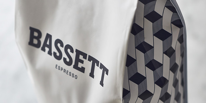
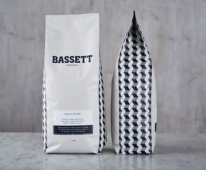
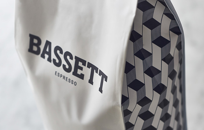
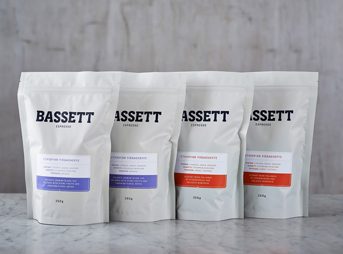
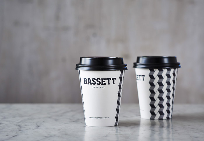
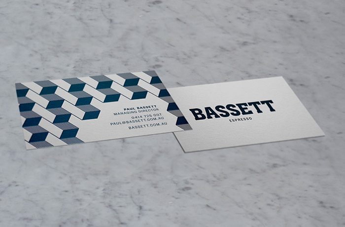
With this in mind, we began rebuilding the brand starting with a revision of the name from Paul Bassett Espresso to ‘Bassett Espresso’. The use of the classic typeface, allows the logo to be commanding with a nod to tradition.
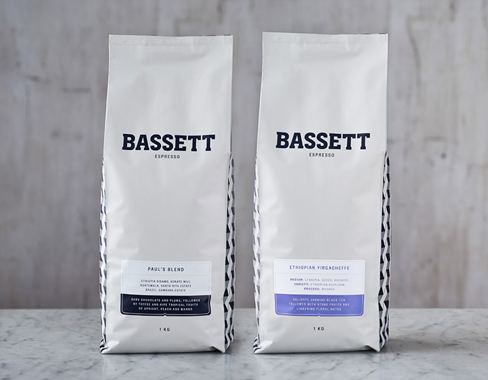
Another important brand device is the custom pattern, derived from a European tessellated tile pattern. The graphic seamlessly aligns art and geometry, symbolising Paul’s approach to coffee as both creative and technical. The final packaging solution demonstrates an aesthetic that is purposely restrained yet bold through its beautifully considered typography, graphic detail and flawless production.
Designed by: Squad Ink, Australia.

Featured on Package Inspiration