
Context
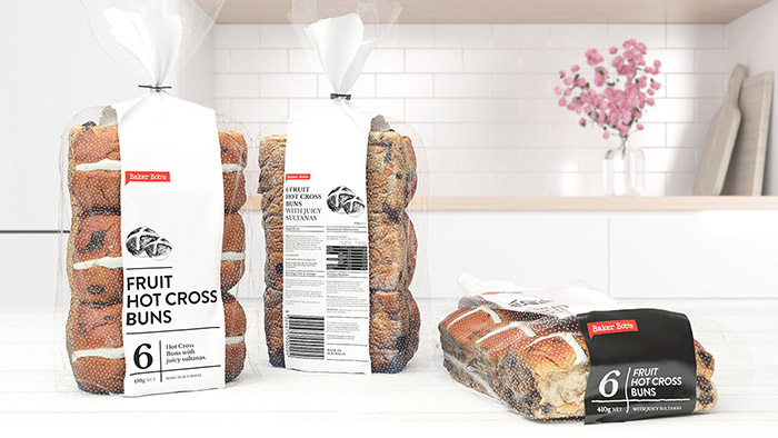
We have been called to worked over a new product that will be launched in Australia: ‘Fruit Hot Cross Buns’.
The brief was to achieve a simple and direct concept, with a minimalist graphics and the guideline, should be 80% clear plastic approx. We need to communicate freshness with a mix of tradicional look.
Solution
We re-design the brand keeping the typography with a new shape to contain the logotype. We believe that a morphology of a ‘dialogue’ shape design will generate a brand who wants to be connected and speaks with their consumers.
For the other hand the design of the packaging is a fair reflection of brand honesty and quality product with enough components to create a system that is impactful from a distance. Has a layer of detail up close, straightforward and contemporary in its communication and an interesting minimal aesthetic. In resumen, we create a packaging design able to blends a traditional bakery aesthetic with a very modern and minimal execution.
Client: Baker Bob’s
Location: Melbourne, Australia
Industry: Food
Status: Completed
Render Artist: James Pazzi
Designed by: # makebardo, New Zealand.


Featured on Package Inspiration
We are young team which works to inspire packaging designers every day! Our team select the best packaging of today and shares with you.

