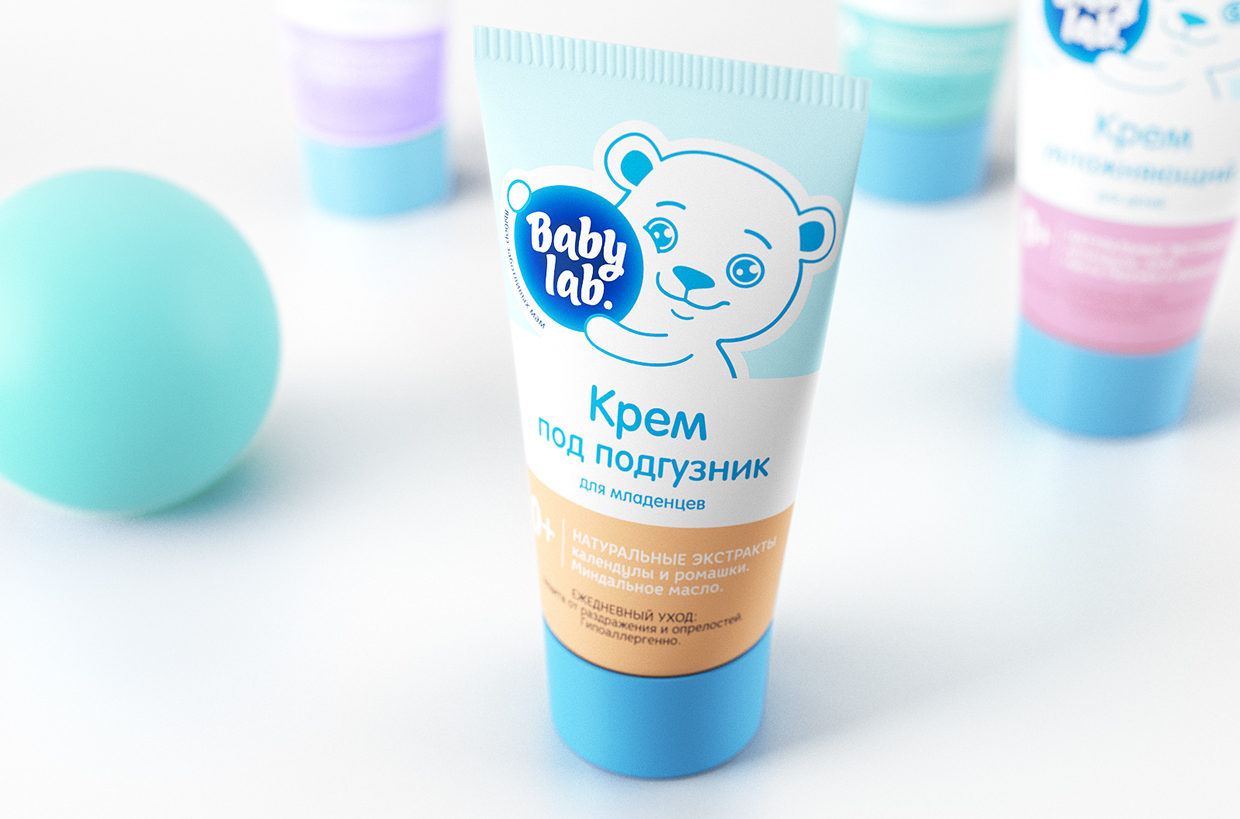
«BabyLab» new packaging design
Being a baby means being cared and loved. It also means being treated with natural body care products. We tried our best to evoke such feelings in customers through creating a new packaging design for «BabyLab» products.
Not all moms can afford the time to read carefully the components of each baby care products displayed on a shelf in a pharmacy shop. But it only takes them a glance to realize whether a certain brand can be trusted or not. This is when a brand becomes an expert in the baby care products market (age category 0+).
By keeping the brand logo and its base colors we have added a bit of a personality to the brand. As a result, the brand has got its own unique hero: a charming teddy bear, a new «BabyLab» icon.
Restrained and somber background colors point to reliability and high quality of a product convincing a customer to buy it.
The outline color perfectly matches the logo and makes an entire product line look complete and unique.
Due to the efforts of Bandiziac designers team «BabyLab» products can now give customers a feeling of delicate baby care and trust through their new package design. Without many words.
Project tricks
The Brandiziac designers team had to take extra efforts to design an outline image of a teddy bear. Overall the team created a few dozens of teddy bear images until the final one was born. A charming smile of the character and a soap bubble leaning to the bear’s cheek have become those features lacking in the beginning. Due to the designers trick the new «BabyLab» character looks live, as if it is inviting your baby to play!
Designed by: Brandiziac, Russia.

Featured on Package Inspiration