Due to financial reasons, domestic vodka brands are more oftenly consumed than foreign brands
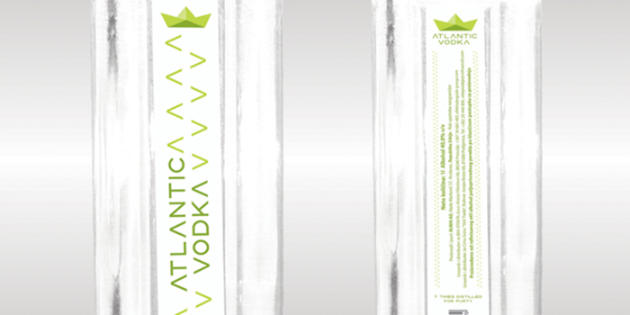
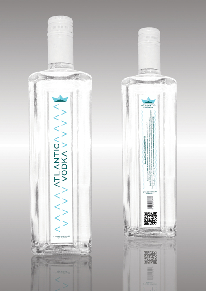
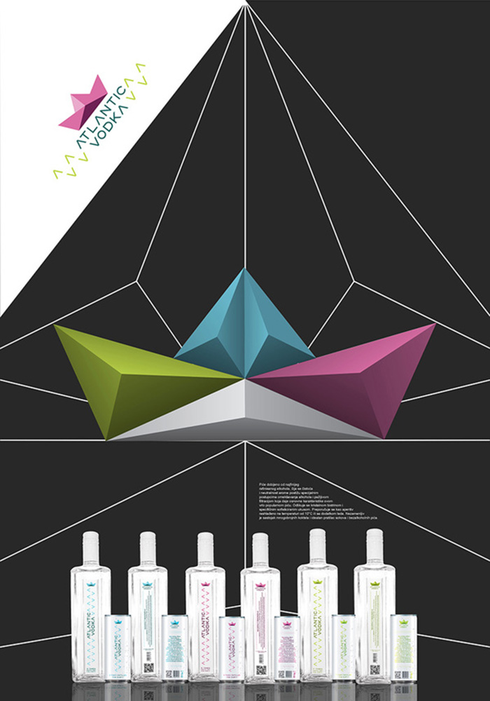
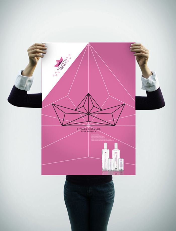
so the main goal of redesigning the outdated package of well known serbian liquor brand “ATLANTIC
VODKA” was to achieve new, contemporary and distinctive visual identity. Label design was done in
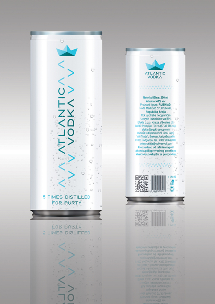
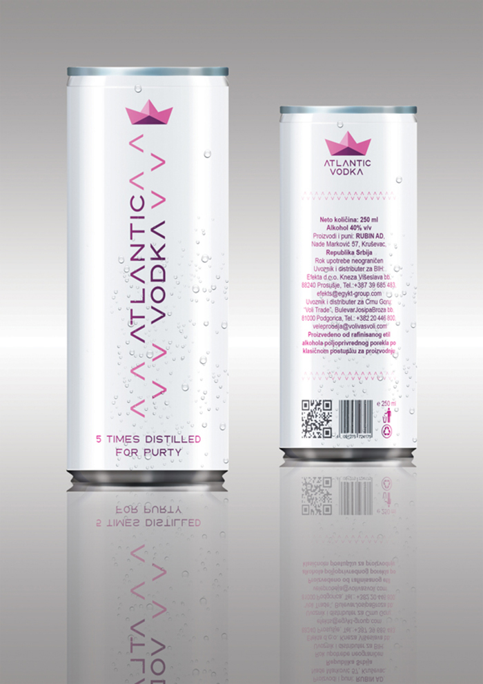
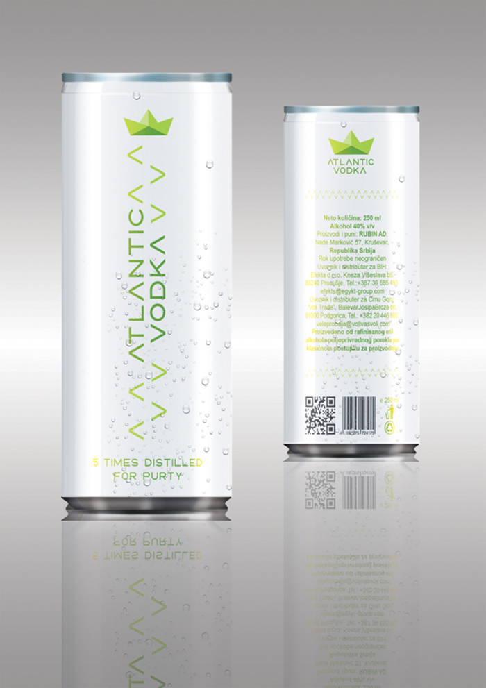
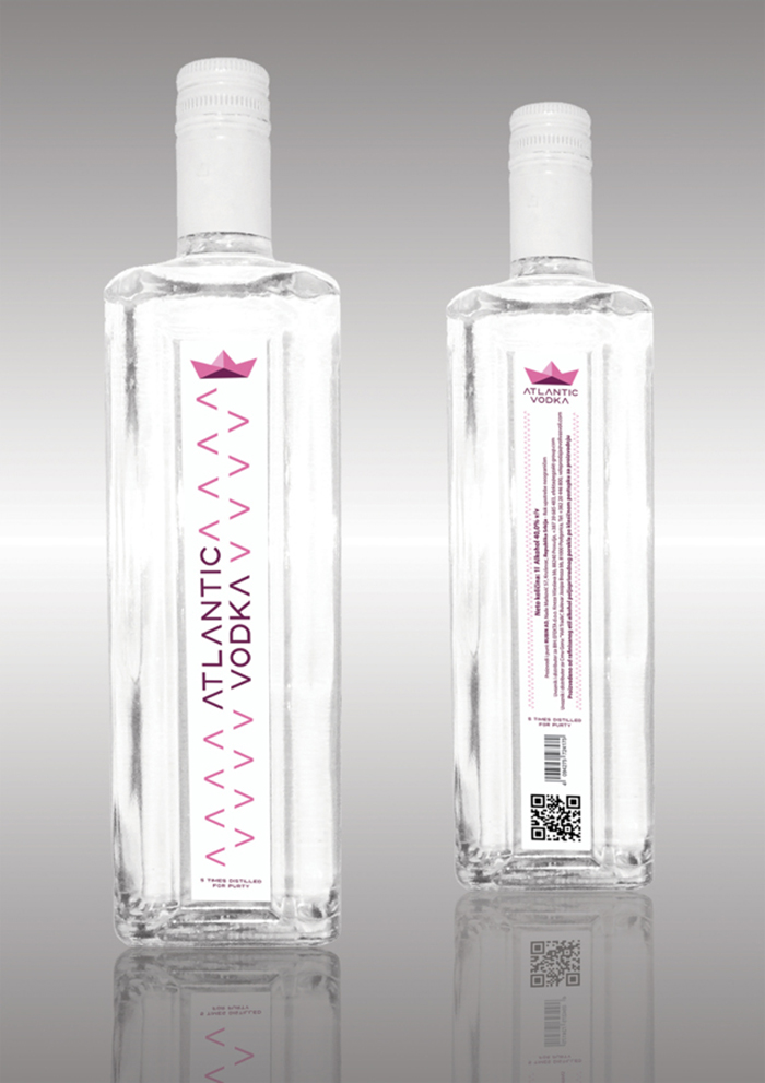
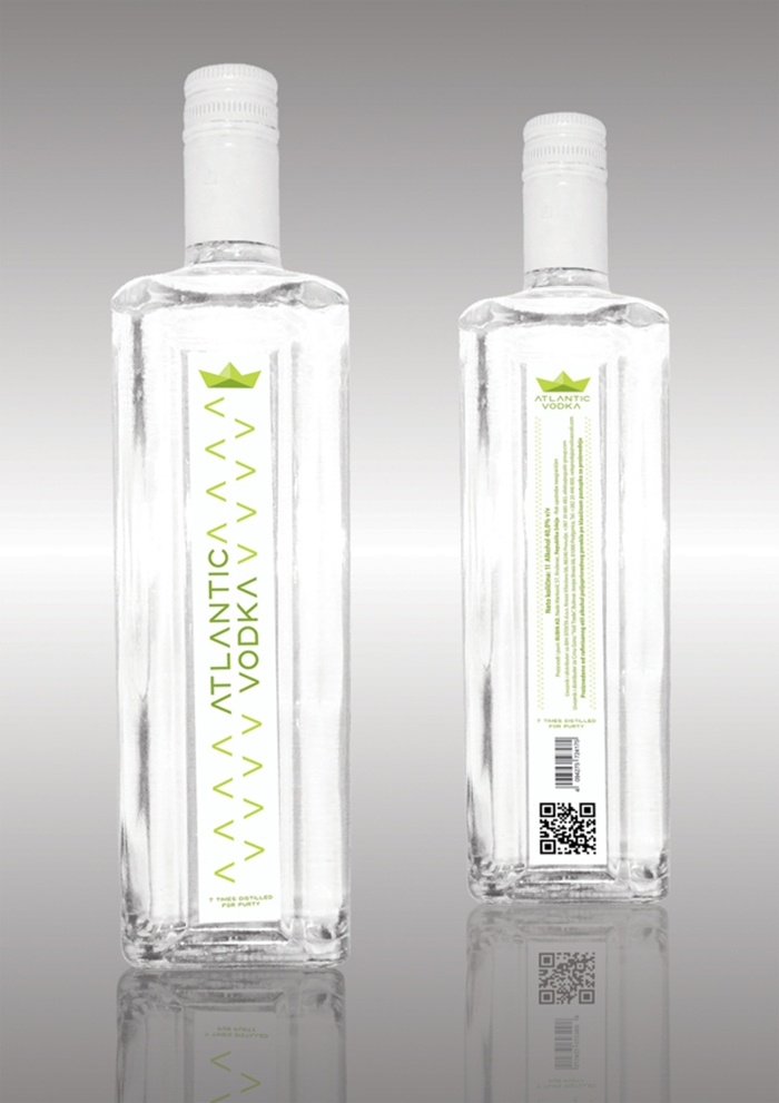
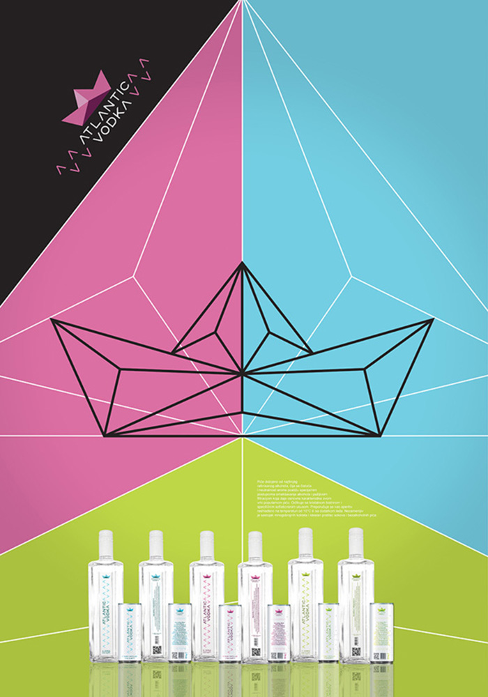
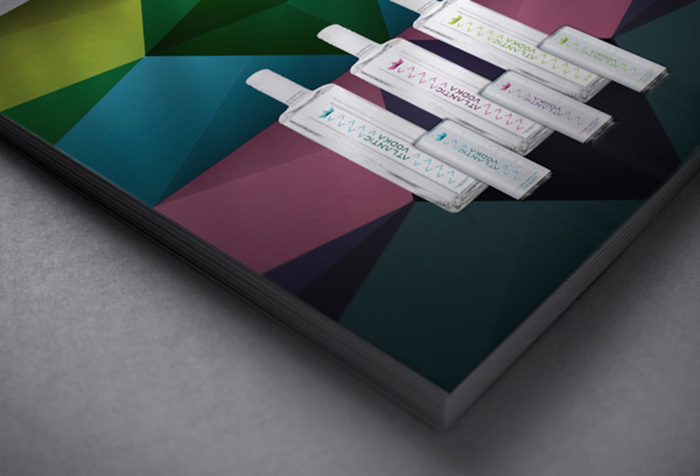
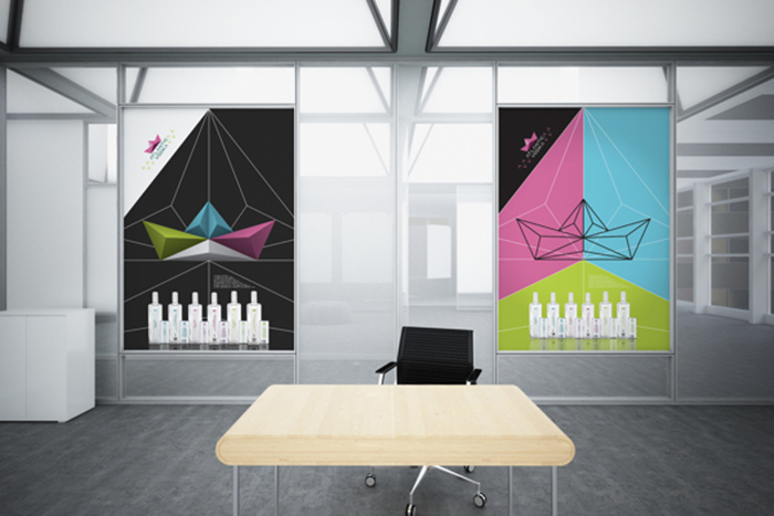
minimalistic expression and consists of color variations of vertical logotypes on a plane white background
depending on liquor edition. By doing so, the liquor itself and white background could change colors due
to night club lightning where this type of drink is commonly consumed.
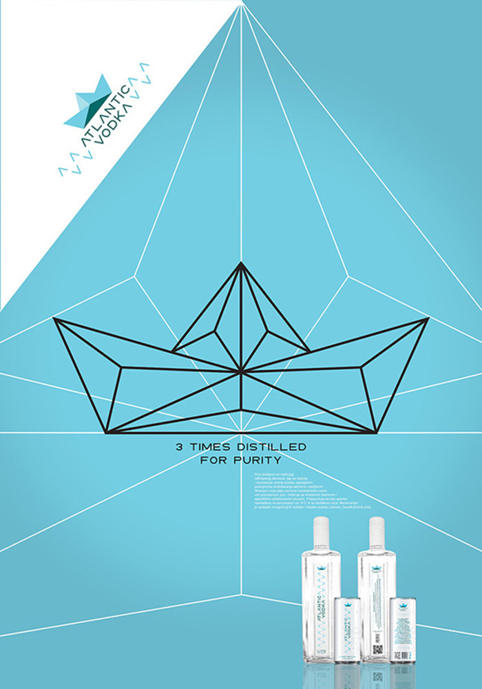
In terms of packaging the main aim was to offer more variable portions by creating 250ml
aluminum can intended for new, younger users and also leaving the standard 1l glass bottle for older
users used to standard packaging. By creating the can package, each consumer gets about 5 standard
sized shots of alcohol per can so he doesn’t need to order the whole bottle. These smaller packages are
more user friendly and adequate for new consumers. Production process of creating aluminum cans is
common and inexpensive.
Designed by: Dusan Fusion Tucakovic, Serbia.





Featured on Package Inspiration