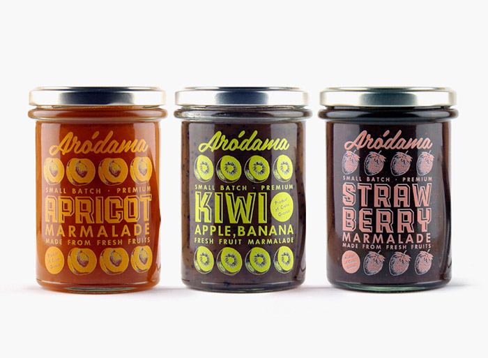
Branding, packaging design and naming for the Arodama family, a new series of traditional Cretan products, aimed mostly to foreign markets.
Both the given name (Arodamos is the tender shoot in the Cretan dialect) and the design of the whole series using vivid colors and illustrations, give a cheerful and playful character to the products. Food is one of the best joys in life, especially for the Cretans and we wanted to transmit that through our design. We drew illustrations for every product showing its basic ingredients and created a pattern that applies to all labels in order to achieve a consistent image for the whole product family.
Products and corporate identity share the same design elements in order to create a direct relationship between them and a strong consistent image. The design patterns and illustrations have been implemented in jars, olive oil and raki bottles, packages, press kits, bags and the website.
Designed by Bob Studio, Greece.

Featured on Package Inspiration