Armadillo brewing collective
As a self initiated brief at University of Hertfordshire I created the visual identity for a home brewery called Armadillo. Armadillo is a microbrewery in Norway’s second largest city called Bergen and it is driven by engagement and passion for beer. The main founder is the cornerstone of the business, but otherwise it is a community of different persons with an interest to try out new recipes and find new flavours. Armadillo’s goals is to be accepted by both the audience and the bars who focus on quality beer. They also hope to inspire other small brewers and to increase the interest of microbrewing.
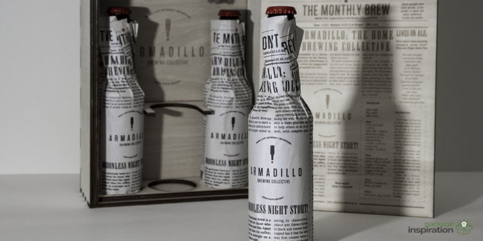
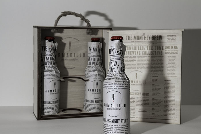
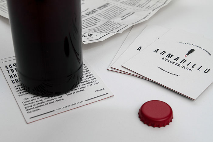
I chose to focus on the constant changing production and took inspiration from newspaper design. As the label had to be cheap to produce, I ended up designing a newspaper page with articles about the brewery to wrap around a clean bottle. As the page can be printed on most printers the cost remains low. The label solution also enhance the space for the newly founded brewery to spread information about themselves and as the bottle remains clear when the paper is removed, it can be used by others who want to try to make their own brew.
Presentable. To show Armadillo of as a serious brewery the beer is presented in a customized box.
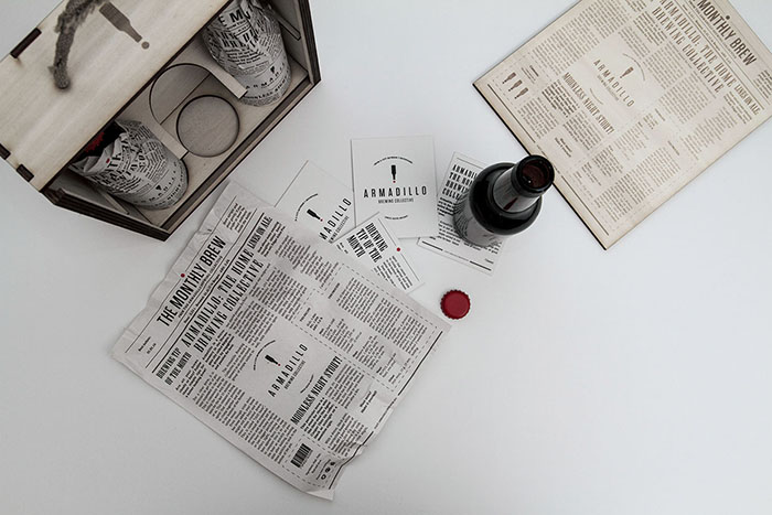
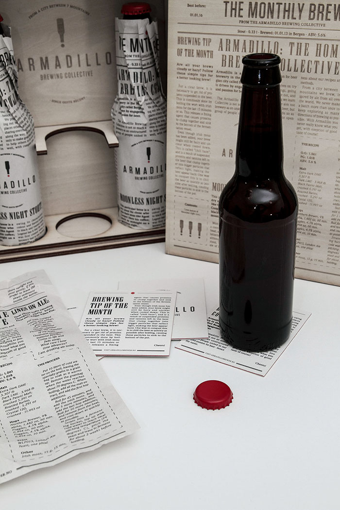
The recipe. On the label, together with tips and news, the recipe and process is explained to make it possible for the buyer to brew the ale.
Clear bottle. Underneath the label the bottle is clean and easy to reuse.
Red. I chose the color red on the cap and the bottle as an exclamation mark in the logo to enhance the newspaper theme.
Posters. As promotion for Armadillo the label is design as an A2 poster together with supplementing posters with sections from the label.
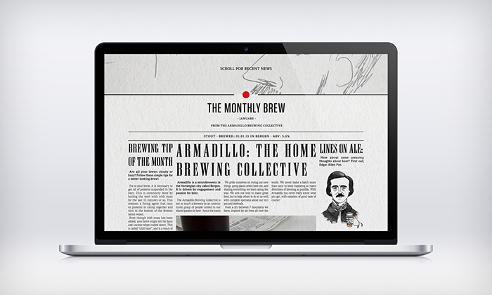
Website. Armadillo’s website is designed as a scroll site where each batch’s newspaper label is presented with extra images.
Designed by: Håvard Fadnes, Norway.




Featured on Package Inspiration