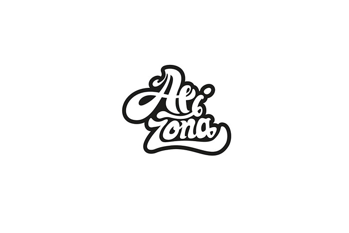
Arizona beverage is primarily targeting at young people who are in the age between 15 to 25 years old who like to try new things, live wildly and look adventures. Their packaging is always using vibrant colour combinations, and visual graphics to create eye movement to attract buyers. The project is to create a new brand and packaging for Arizona and its new energy drink production line. The current Arizona logo has both graphic patterns around the name Arizona, however they don’t have a connection to link its graphics and typography beside its colour. Arizona is a long name that often forces designer to either tilt its brand mark or place it completely vertical on the can. I picked graffiti style for the new Arizona logo and packaging which is best to communicate the company ideology such as young, and adventurous. Most importantly, graffiti often uses vibrant colour combinations, which also coordinate with the Arizona beverages’ stylistic. The brand name is broken into two parts as Ari-zona to eliminate its lengthy brand name.
Designed by: Allen Cheng, Canada.


Featured on Package Inspiration