
With a pre-existing brand and packaging system that devalued the premium quality of the product, Arithmetic was tasked with the challenge to rename, reposition and overhaul the design aesthetic of Sea to Sky Seasonings popular salt collection.
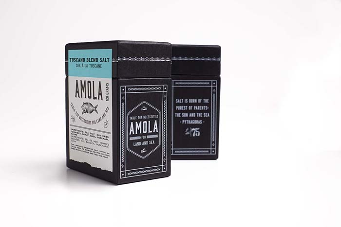
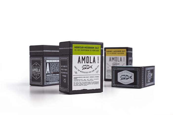
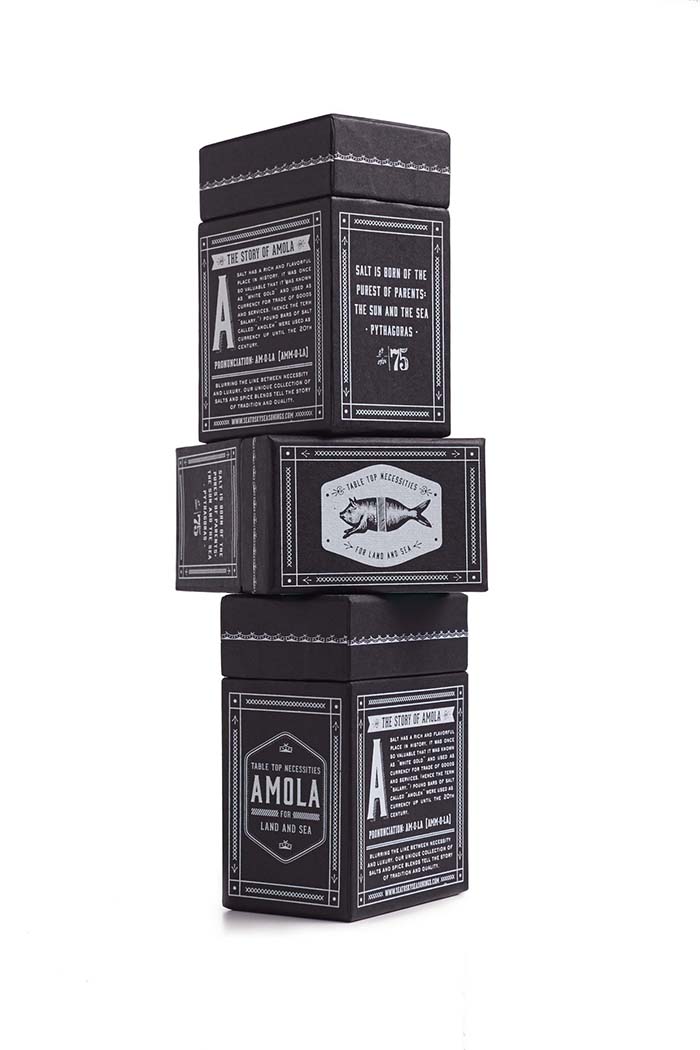
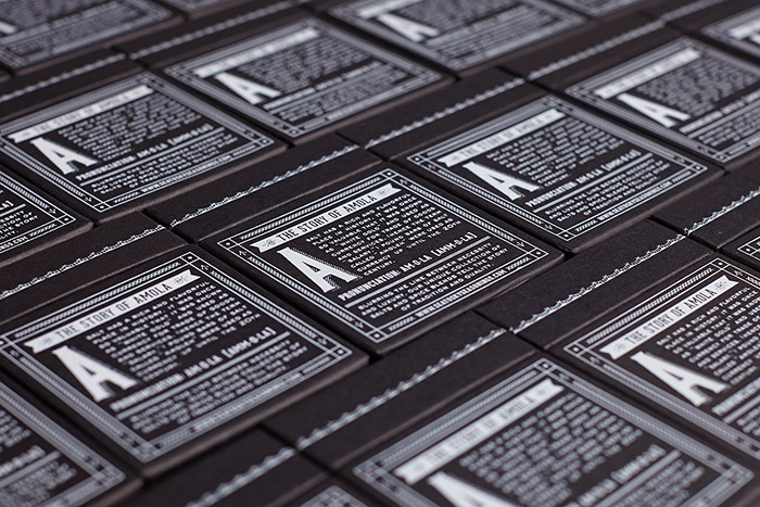
Copious research led us to the rich history of salt and salt trading, proving it evident that telling the products narrative was of the upmost value. With the story at the forefront, the project called for a largely type focused design solution. The name AMOLA was created from the word “amoleh”, the old word for pound bars of salt that were used as currency up until the 20th century and were so valuable it was known as white gold.
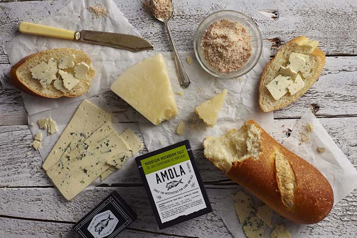
The key message that the client wanted to convey was that even though their gourmet salt is a premium product it is still an everyday necessity when cooking. Since their consumers use their product for seafood and meat, arithmetic coined the tagline “Table top necessities for land and sea”.
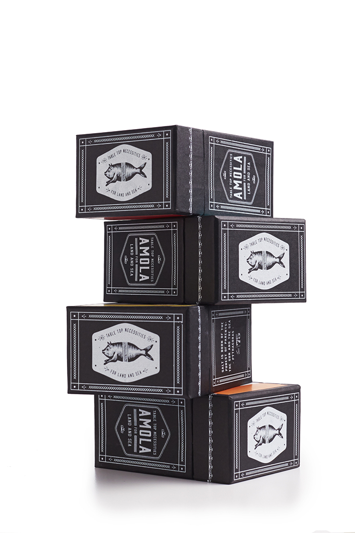
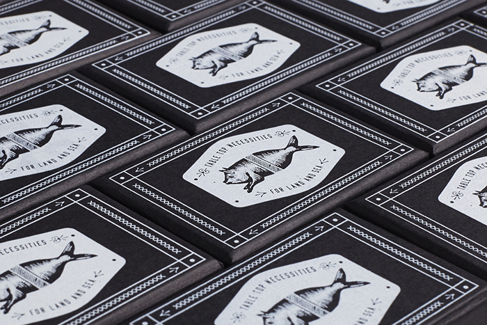
To pulling each of the story elements together, we developed a visual language that is both sophisticated and down-to-earth allowing the type to play center stage. The strong use of black and white paired with a consistent upper case font setting created a masculine setting while the delicate border trim infused the right amount of femininity. The perfect marriage for the gifting market geared towards the foodie.
We selected Geared Slab as the main typeface because of its industrial characteristics. It’s mechanical curvatures tell the story of a time when salt was imported into old shipping towns.
The front end of our design process focused heavily on streamlining the production characteristics and retail selling features of the packaging. With both consumer and retailer in mind, the rectangular shape was created to allow for maximum visibility on shelf and the size was determined to allow for the perfect amount of boxes to sit on retailer shelves with ease.
Blurring the line between necessity and luxury, the end result is type focused packaging solution that tells the story of tradition and quality with packaging that is optimized to go the distance in sales.
Branding & Packaging Design by: arithmetic creative, Vancouver, Canada.
Featured on Package Inspiration
We are young team which works to inspire packaging designers every day! Our team select the best packaging of today and shares with you.
