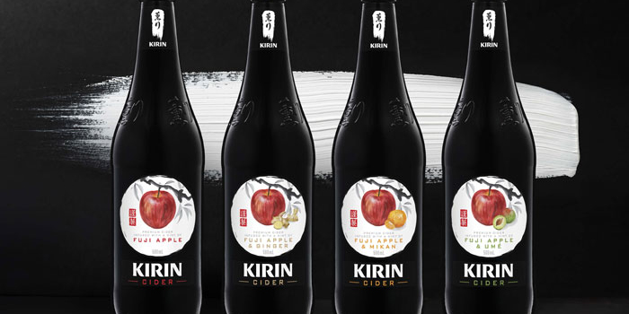
“Japan is known for its passion for innovation, precision and the mastery of fine techniques and complexity. So when Energi were engaged to develop the brand identity and packaging for a premium range of ciders from Kirin we set about our exploration of various disciplines before focusing our sights on traditional Japanese calligraphy and water colour art styles, leveraging this in our designs.”
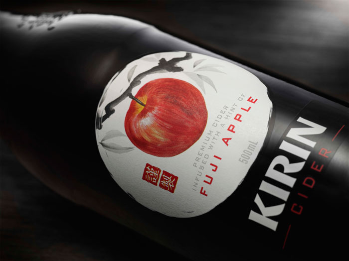
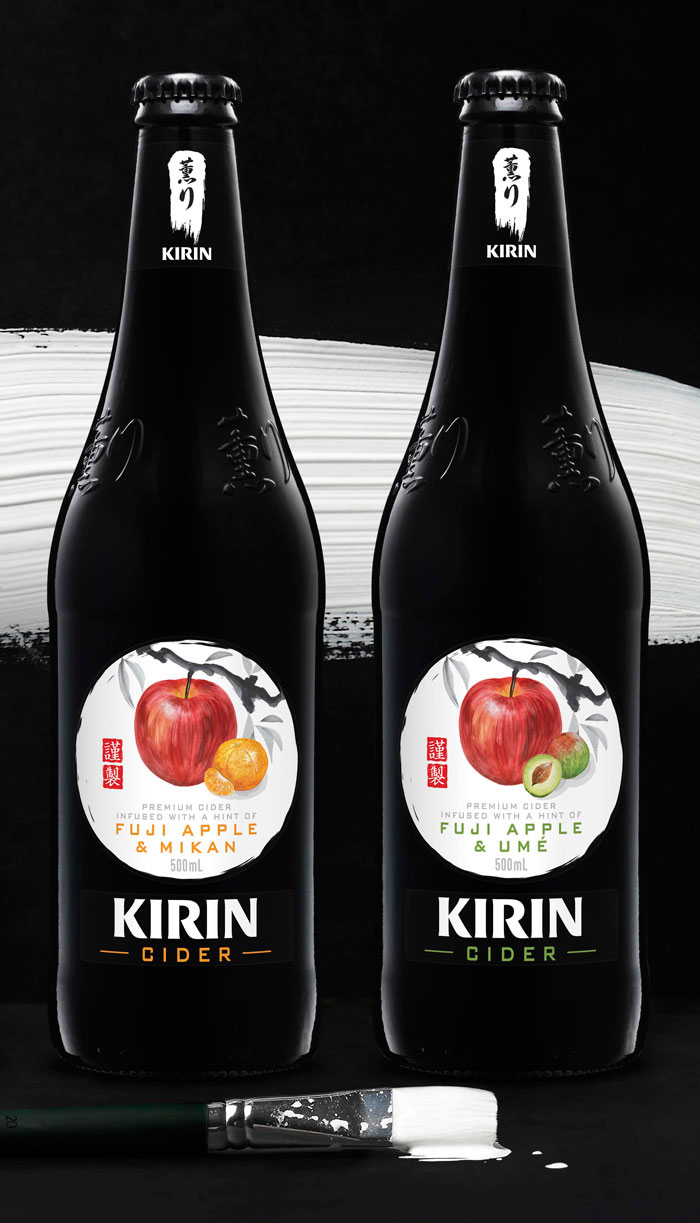
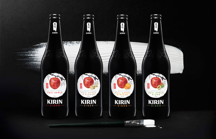
“In a collaboration with Melbourne based Japanese artist Junko Azukawa a series of beautifully crafted artworks were created for each of the ingredients, along with a sumi-e style apple tree branch and the ink calligraphy of the sub brand kanji characters. With care, these core brand elements were combined on the packaging with a brush stroke to hold the kanji characters, a hand painted circle to frame the ingredients, and a traditional red artwork signature stamp, all to capture the attention to detail of authentic Japanese craftsmanship.”
“In a collaboration with Melbourne based Japanese artist Junko Azukawa a series of beautifully crafted artworks were created for each of the ingredients, along with a sumi-e style apple tree branch and the ink calligraphy of the sub brand kanji characters. With care, these core brand elements were combined on the packaging with a brush stroke to hold the kanji characters, a hand painted circle to frame the ingredients, and a traditional red artwork signature stamp, all to capture the attention to detail of authentic Japanese craftsmanship.”
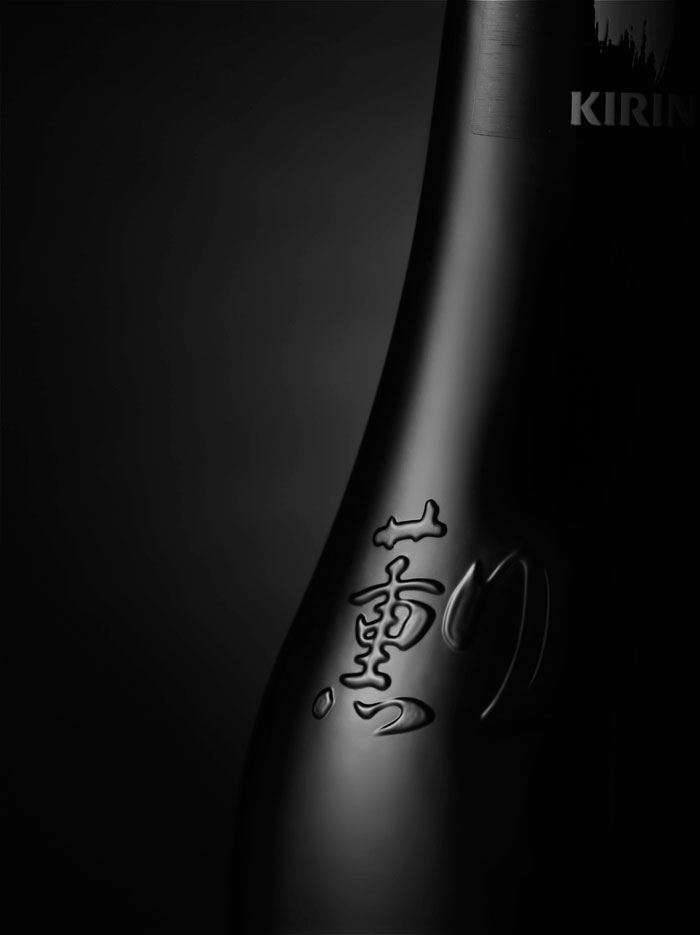
“The striking, near black bottle with its simple minimalist design aesthetic balances the traditional with a progressive modernity that is appealling for both male and female consumers who are seeking a sophisticated and unique alternative in this exploding category. Every aspect of this product was a pursuit of perfection, right down to the texture varnish on the labels to achieve a traditional washi paper feel.”
Designed by Energi, Australia.


Designed by Energi, Australia.
