Agency: Moloko Creative Design Agency
–
Description:
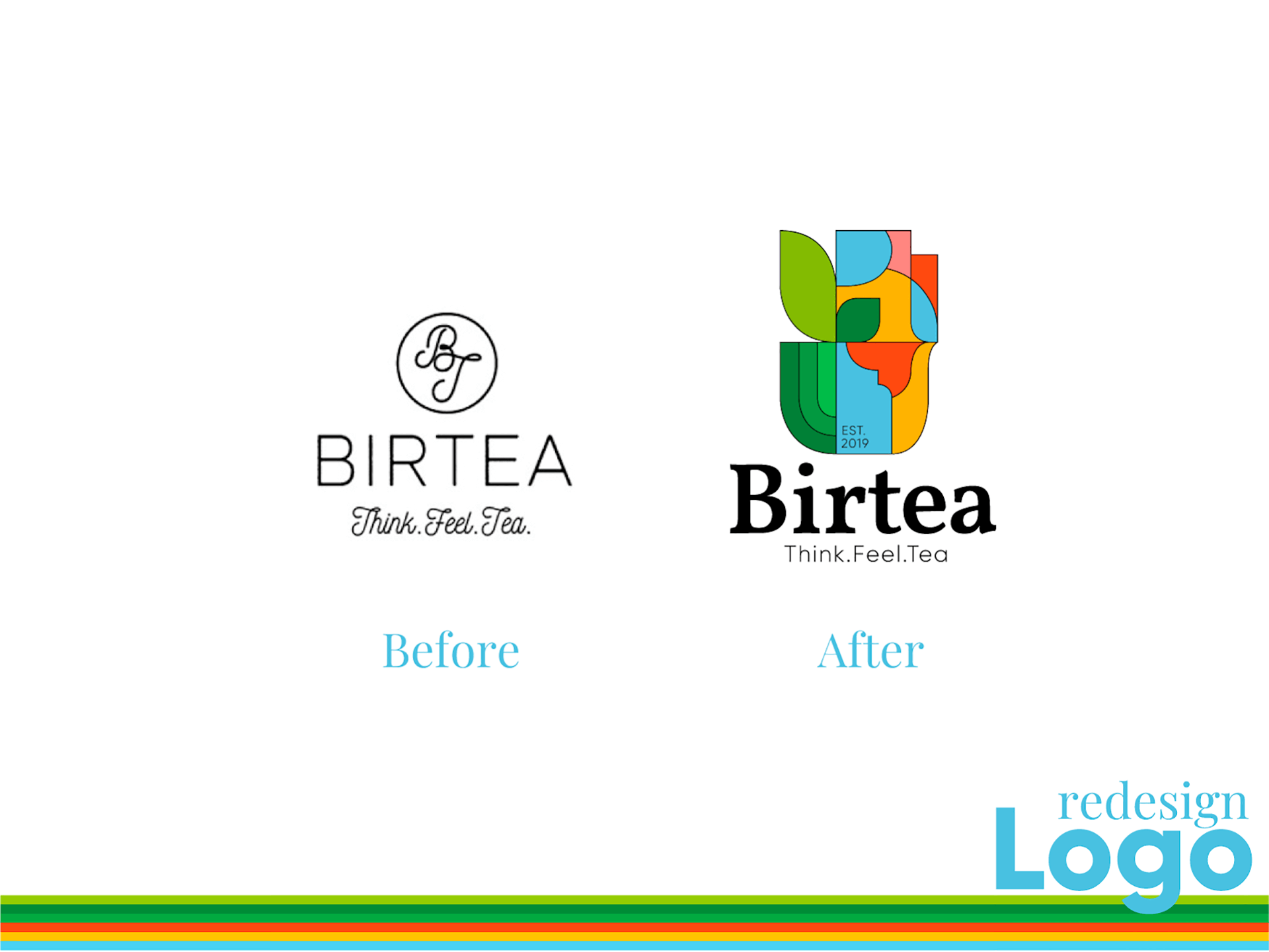
The first task of the project is to redesign the existing logo. The existing version of the logo was associated with Rio de Janeiro, and was not in any way associated with Morocco. It was also important for the client that the new logo became more minimalistic, but kept its elegance.
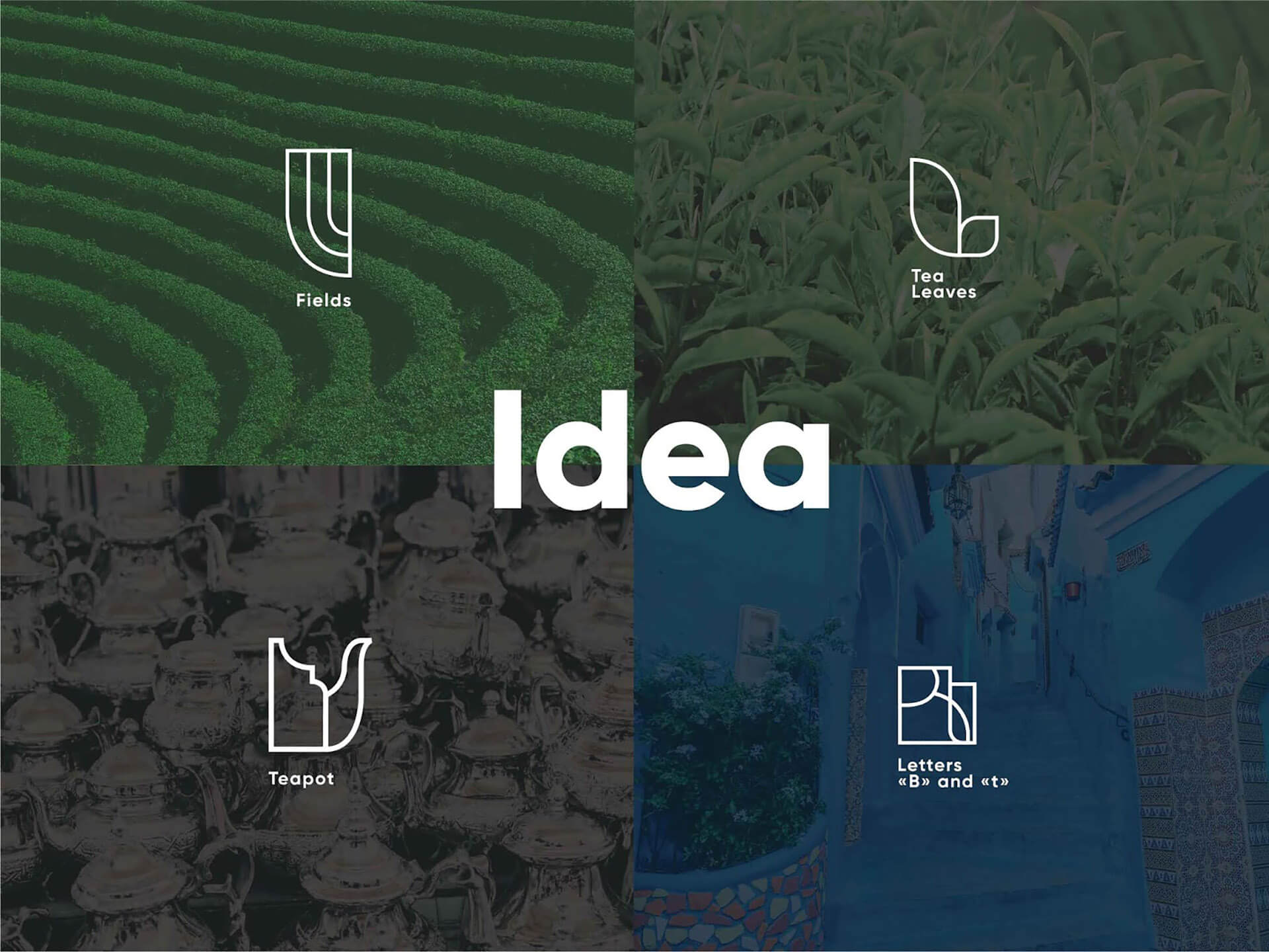
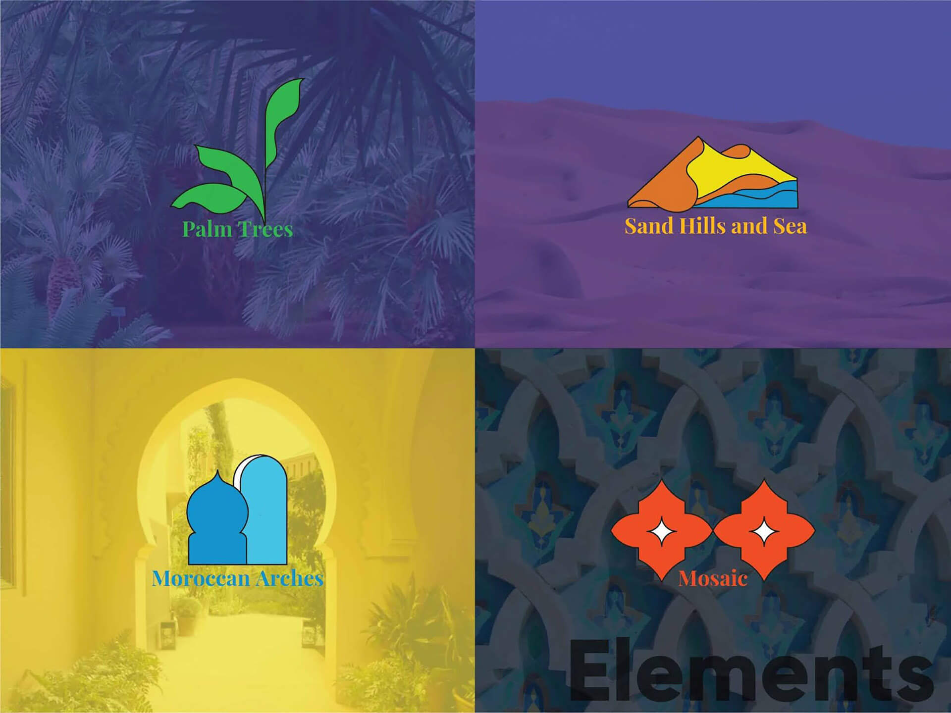
In the design, we used references to the architecture of the tea producing country. The design of the logo reflects the architectural forms of Morocco.
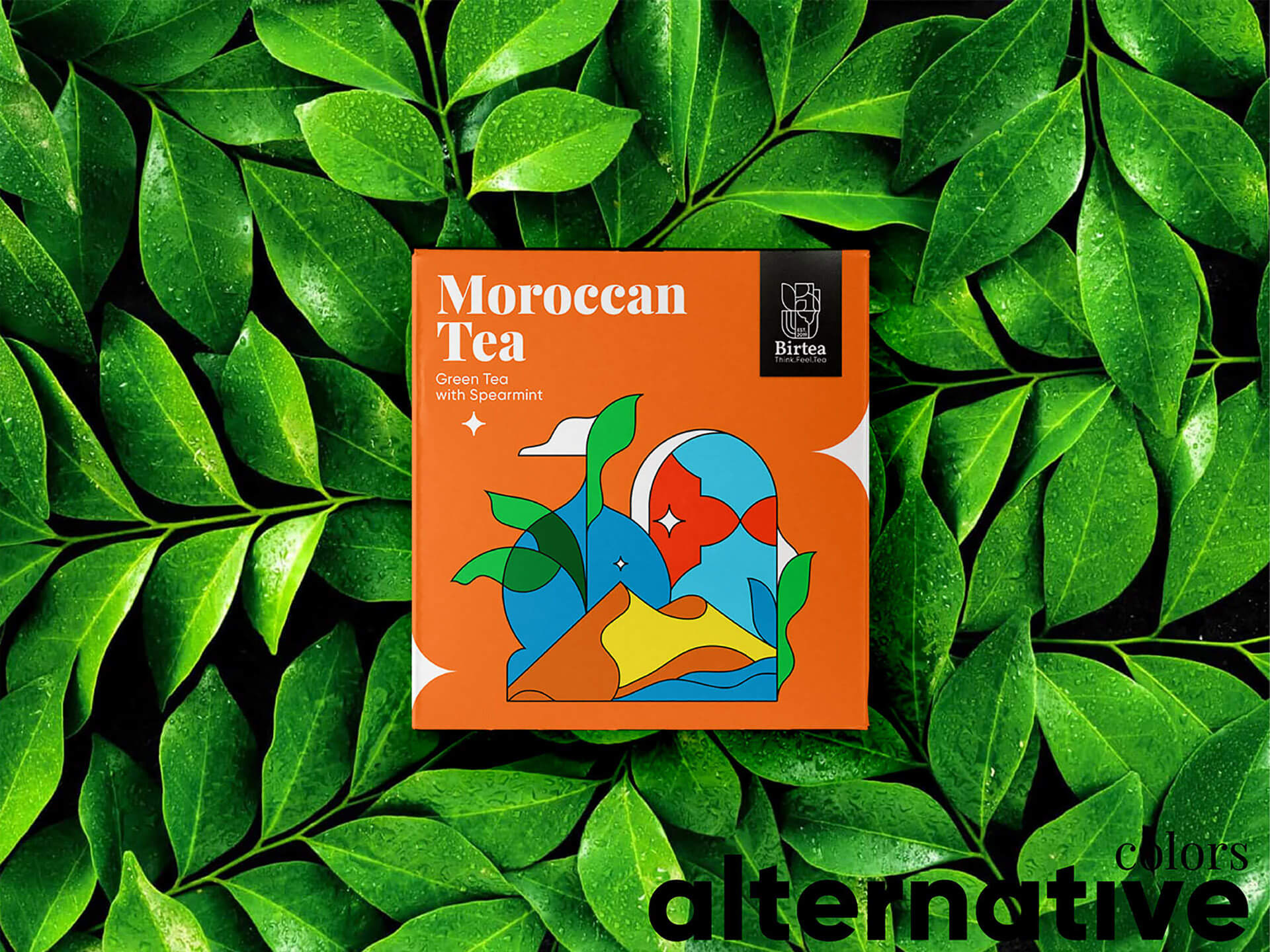
The colors are friendly and exclusive. They reflect the origin of tea and create references to Moroccan mosaics and stained-glass windows.
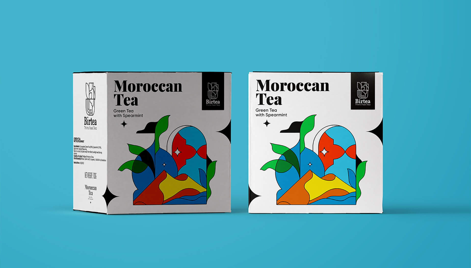
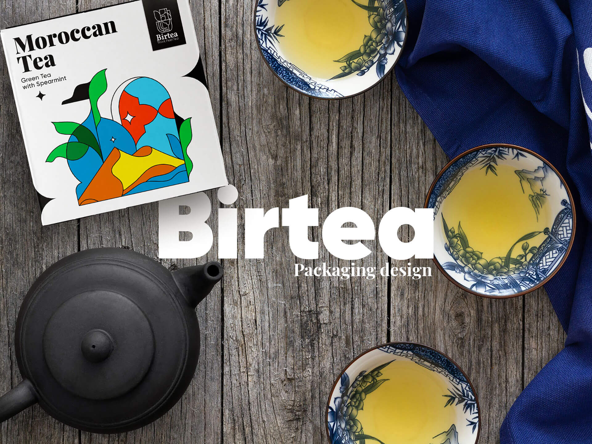
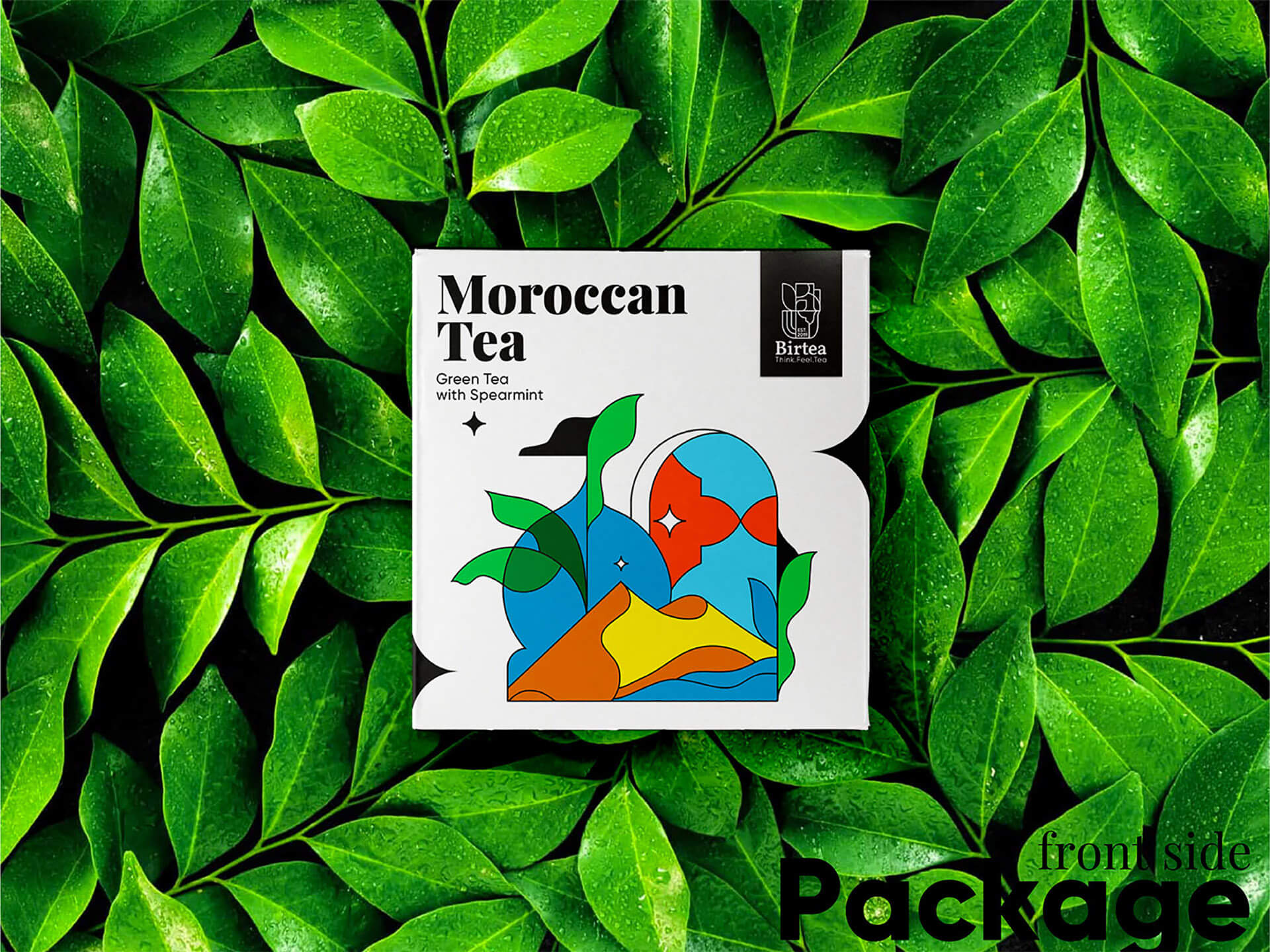
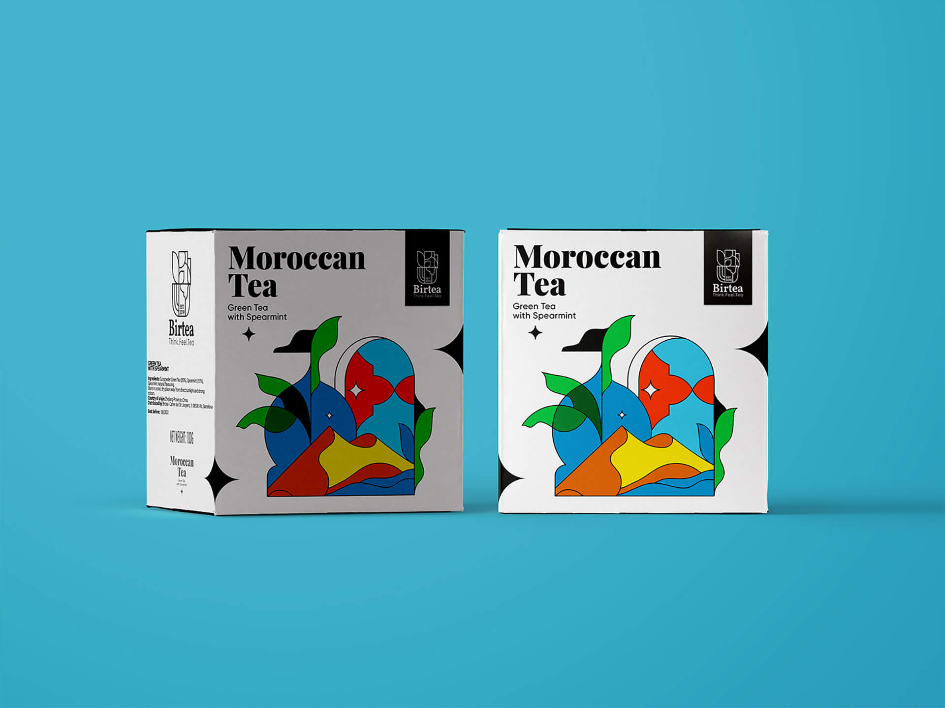
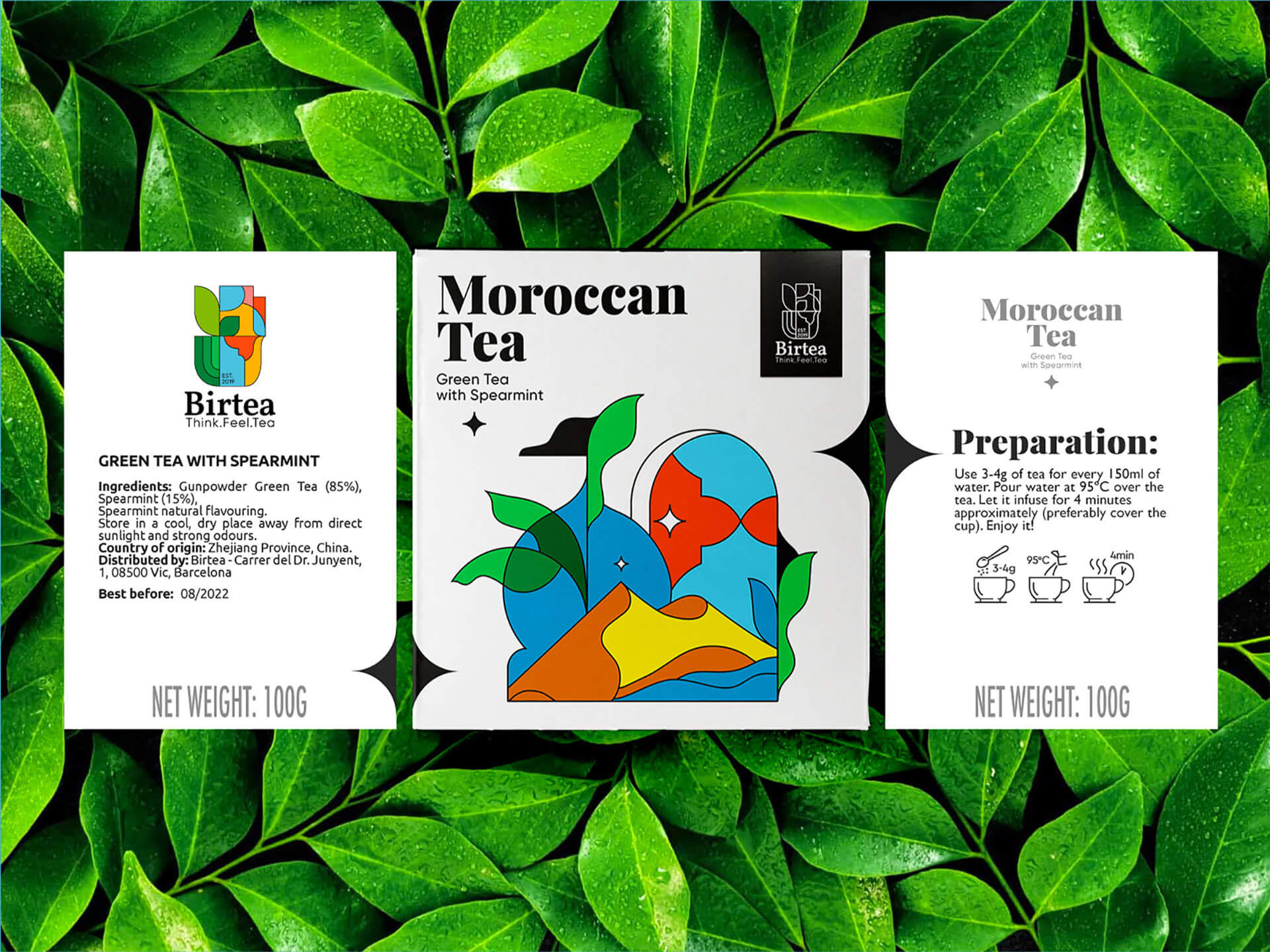
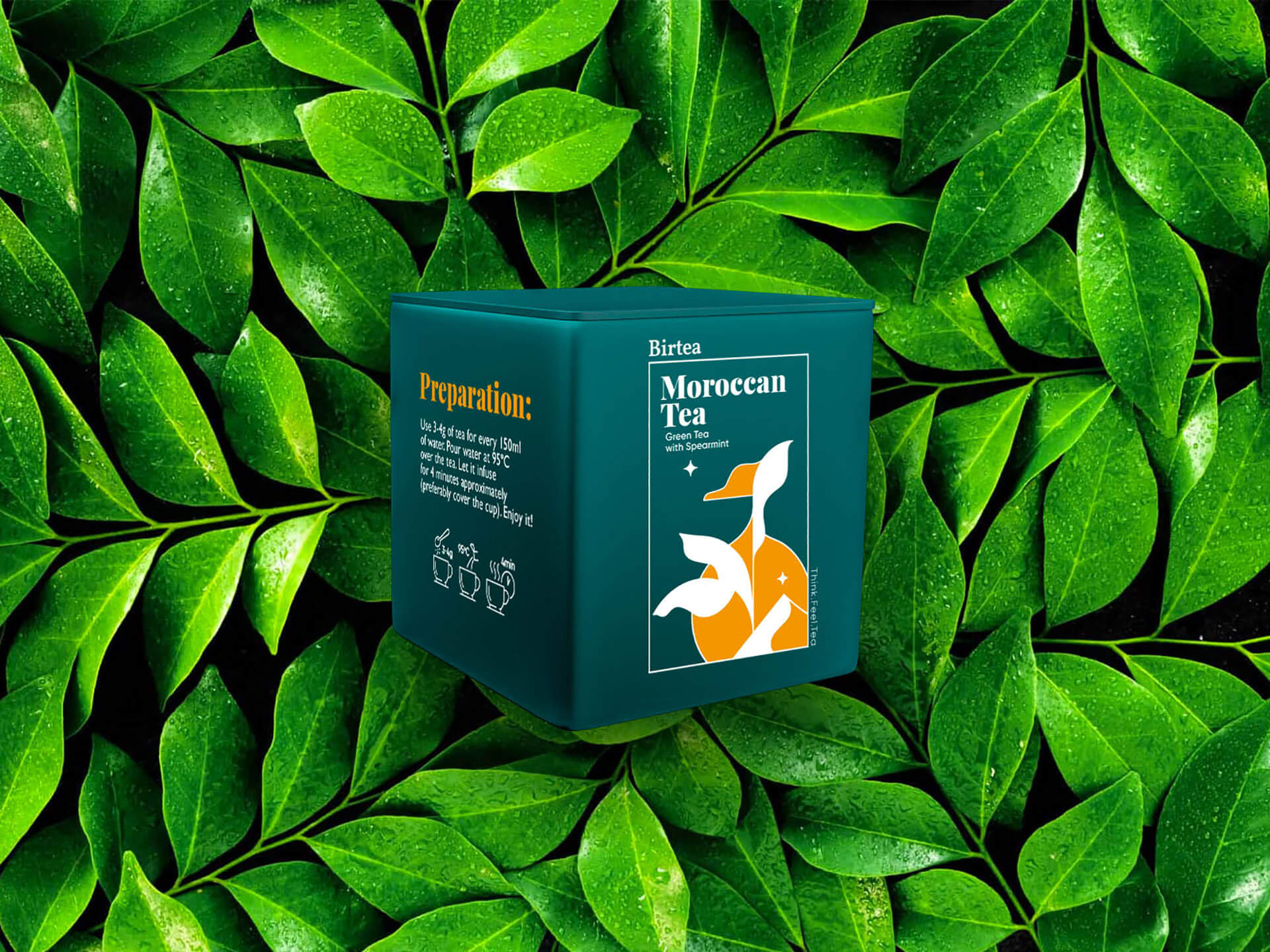
The colors and lines of the logo should also have been reflected in the design of the tea packaging. The task was solved by using illustrations on the packaging. It follows the same principle as the logo, with references to natural and architectural forms. This is how we created a dynamic design that can easily adapt to the different types of tea in the series. All you need to do is to create similar illustrations while preserving colors and style.
In this way, by keeping the same style of logo and packaging, we have achieved the integrity of the entire concept.
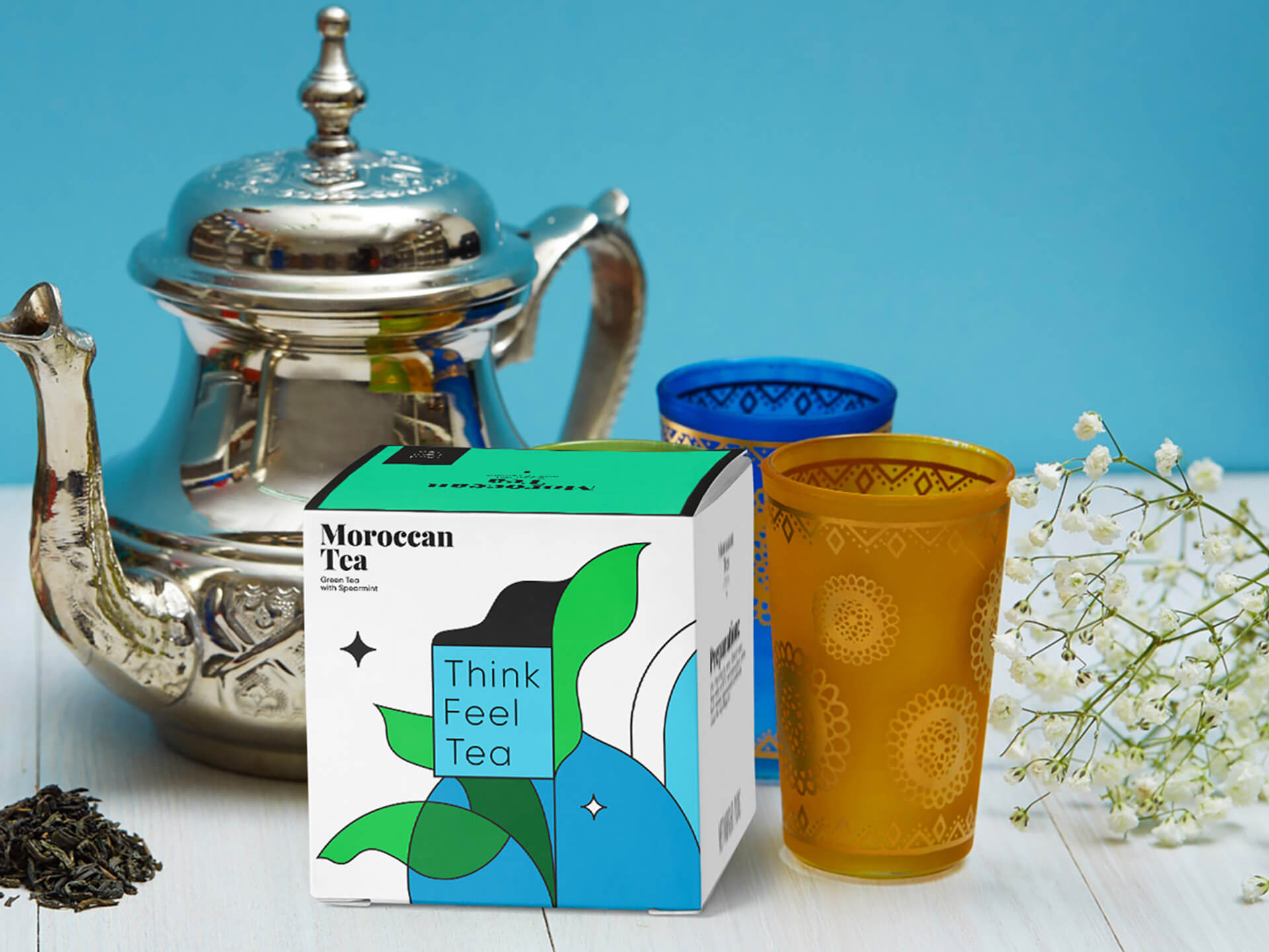
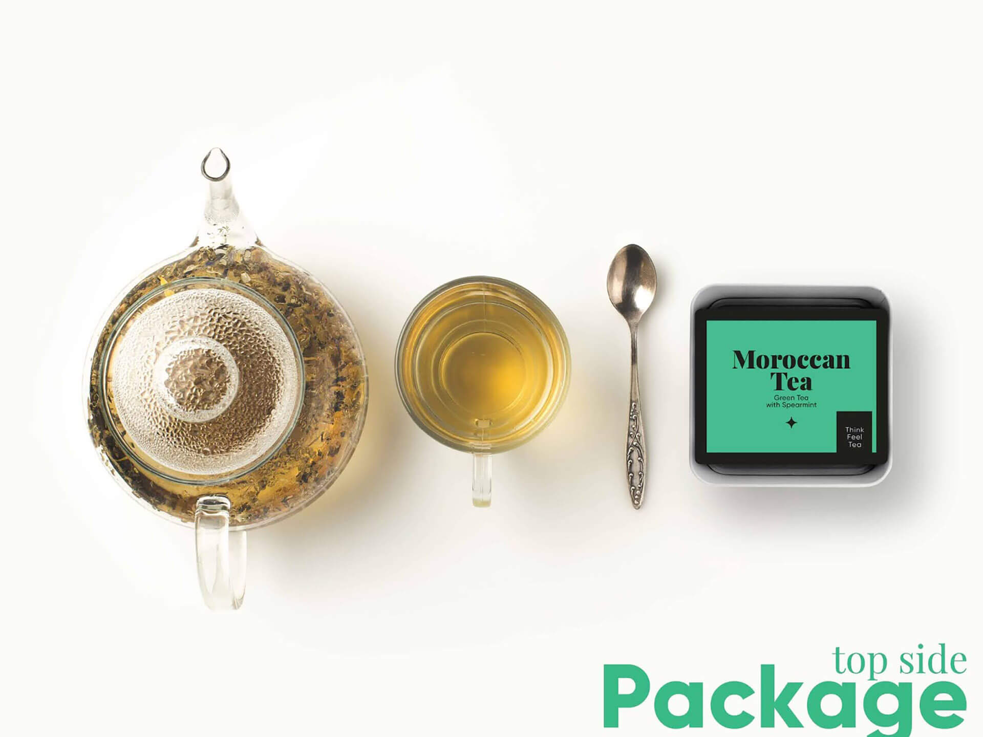
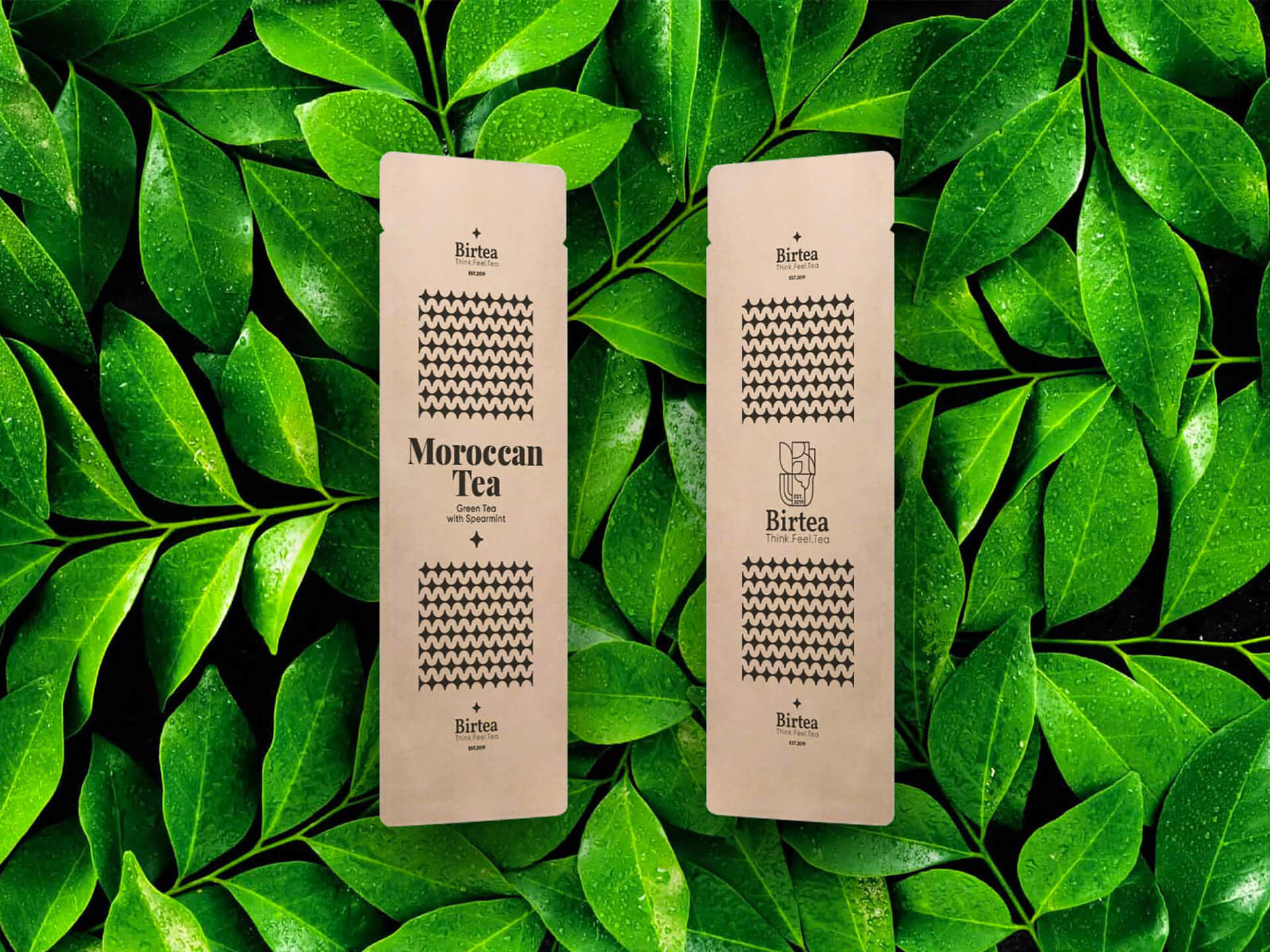
Creating the packaging design, we have adapted it to all the materials that will be used by the customer in the production and sale of tea.

Featured on Package Inspiration