Designed by: SONG 송이, Korea.
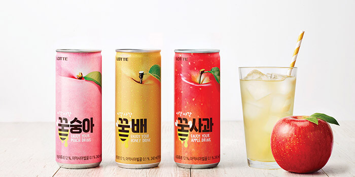
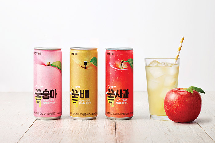
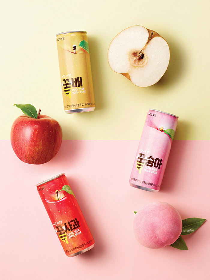
Honey-peach, Honey-pear and Honey-apple packaging are design to depict each fruits intuitionally throughout the product and the packaging guarantee visual identity as motifs from the each fruits in Honey – juice family.
Honey – juice package design just like eating fruit leads consumers to easily and quickly realize product properties.
Honey pronounces “꿀” in Korean language.
Honey-pear drink packaging made by mixing stripes and wings that characterize honeybees and express its Identity represent the drink containing honey with impact and intuition.
Besides fruit image and BI, “꿀” juice packaging with plain and simple design remove the complexity and show a refined Image and remarkable an impact by delivering simply and finely product properties.

Featured on Package Inspiration
We are young team which works to inspire packaging designers every day! Our team select the best packaging of today and shares with you.


