–
Designed by: Bea Tiraratana, USA.
–
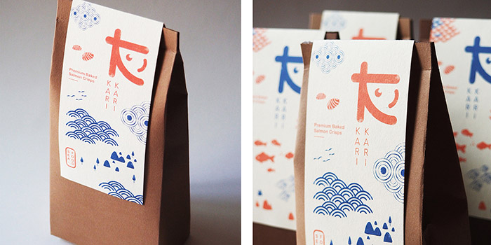
Kari Kari is a fresh homemade business and a fun brand that offers healthy and savory snack foods to the consumers. The products include premium baked salmon snacks come in a variety of flavors such as Mozzarella, BBQ, Seafood, and Original Flavor. In Japanese’s onomatopoeias Kari-Kari (カリカリ) is referred to a crispy-crunchy sound, a sound that everyone would enjoy in every bites of Kari Kari’s premium snacks.
I’ve had the opportunity to design their new packaging and logo, It was a very fun and exciting project to work with. The concept is to represent a brand’s refreshing look and able to bring out their homemade, friendly, and organic feels by using the earth tones and durable-recycle paper materials. The illustration interprets a storytelling of the products and to provide a visual interest to the audience’s eyes. The overall style is inspired by traditional Japanese’s art practices, as well as the colors which has adapted from their cultural red and blue tones, but brighten up the red with salmon’s color. For the logo I’ve combined three ideas of salmon, a letter ‘K’ and Japanese’s alphabet together to communicate a language of a brand. I also came up with idea of a business card that can be made into a book mark, another lovely and useful way to keep a card.

Featured on Package Inspiration