Hey, I don’t need the branding,
I needed a plaster!
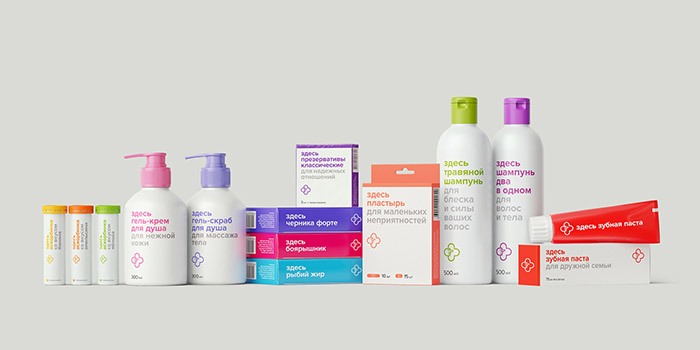
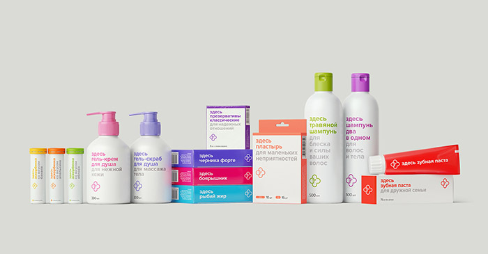
Challenge: To develop the identity and design for «Zdes Apteka» brand’s own product line. To create a simple, easy to remember style, to emphasize the availability of the product for an ordinary person.
Solution: When a person comes into the pharmacy he isn’t looking for a packaging design, he needs help and wants to solve his problem quickly. He thinks this way: «Hey, I don’t need the branding, I needed a plaster!»
The modular idea of naming reflects the pharmacy name and product names. We communicate with the customer in each package, telling him what the product is like and what it is used for. Concise design and intelligible in formation create simple and memorable image. What is more, we have managed to bring emotions, show our kindness and emphasize the care for the customer. Communication doesn’t exaggerate; it conveys the exact value of the offer that the buyer gets. Everything is fair and humanly distinct, without any complications. Need help? Come in! Here are eye drops, here is thermometer, and here – sea buckthorn oil. Oh, a patch? Here it is as well!
Designed by: tomatdesign º, Russia.

Featured on Package Inspiration