
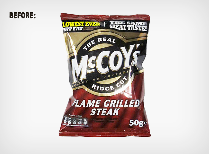
McCoy’s potato chips have long been marketed as “man chips”, but they’ve never looked or felt particularly manly. We set out to change that with a packaging redesign. The challenge was to differentiate McCoy’s from other brands, and do so in a uniquely manly way.
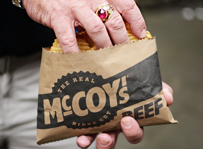
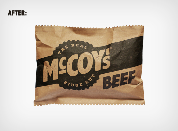
The big idea wasn’t in the graphics, but in the actual structure of the packaging. We decided that the bag should open along its longest side, contrary to conventional chips bags. This means the bag remains exactly the same size, but the opening is extended by a whole two inches, so proper big-handed men can actually fit their hands into the bag.
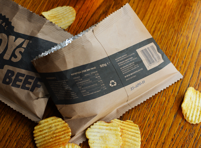
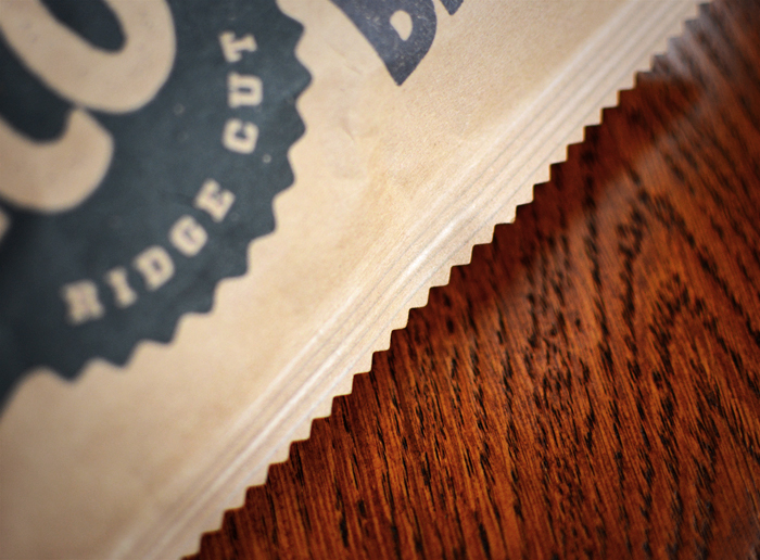
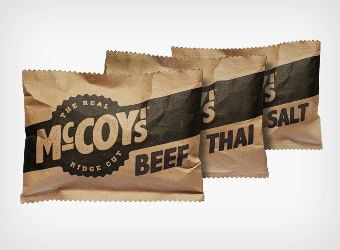
Next we manned up the design by stripping away the clutter, simplifying the branding, replacing the usual reflective foilized plastic with matt foilized kraft paper, and printing in black ink only. Extravagant flavors like “Flame Grilled Steak” and “Thai Sweet Chicken” were renamed simply to “Beef” and “Thai”. As a final touch the top and bottom were cut in a ridged line, to reflect the ridge cut of the chips inside. The end result is simple and manly: The Real McCoy’s.
Agency: BTL Brands, London & Barcelona.

Featured on Package Inspiration