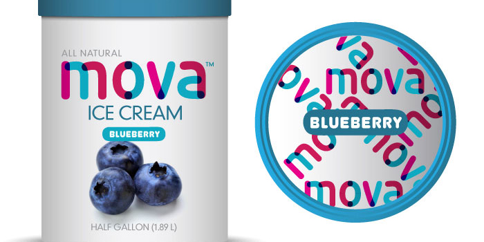
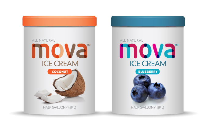
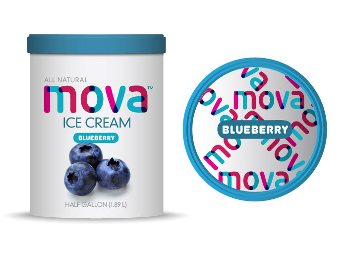
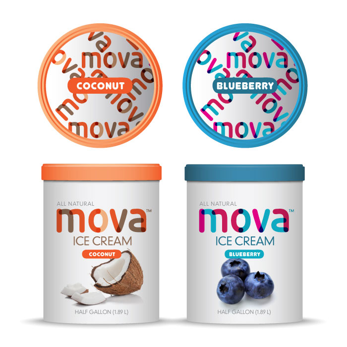
Mova is a small ice cream shop owned by a husband and wife team. Small but big (as they’re now jumping the ocean and being introduced to the States) needed a design to represent this amazing ice cream product. The colors and overall packaging showcase a clean and bright product just like their ice cream.
“Mova Ice Cream is an English brand ice cream and is now being introduced to the American market. Based in the heart of England’s beautiful Camden District, the business is run and owned by husband and wife team Matthew and Isabel Mova.
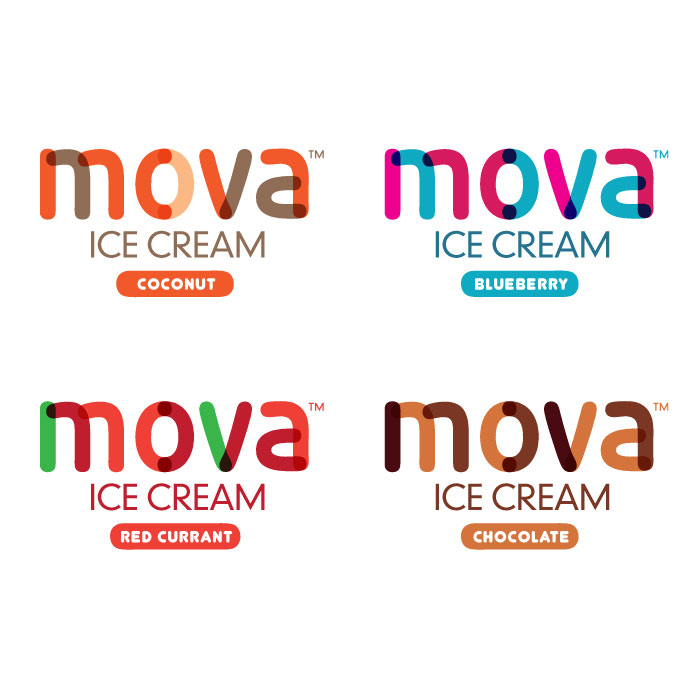
Mova Ice Cream is full of the finest ingredients skillfully blended into an exciting feast of flavours that are purely indulgent. In order to captivate the consumer, we brought a quiet purity to the overall design of the packaging yet enlivened it by introducing a whimsical and artistic approach to the Logo/Branding, which was a perfect representation of the bright taste and quality of their products.
Design Studio: Luko Designs, Los Angeles, USA.

Featured on Package Inspiration