No standards. There is no fight. There is no primary command.
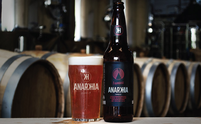
Through the clean and minimalist concept, walking in contamão chart patterns on the packaging of microbrews. The visual identity of Beer Anarkhia rescues movements against culture. Beer brings concepts to its packaging, a closer conversation different from the retail packaging.
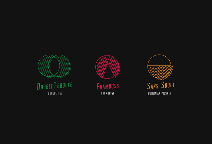
Voluntary order without government coercion were cries order issued in anarchist movements in the twentieth century, no government but not runaway ideas were supported by idealists. In the graphic communications bring shifting lines and circles that make up icons of each style, there is not a center but an idea. There is a voluntary order suggesting each person a different meaning. In the absence of field of a message, each understands what you want, obeying his conscience.
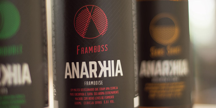
Each is his own master. The letter K and H suggest letters of the Cyrillic alphabet, used in the Union of Soviet Socialist Republics (Союз Советских Социалистических Республик) or USSR, a land of struggle for the Socialist State. Labels proposes a vinyl texture, conveying the idea of resistance and inviolability of its concepts.
Designed by: Abio Design Studio Lab, Brasil.


Featured on Package Inspiration