
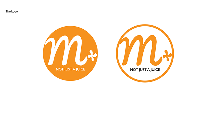
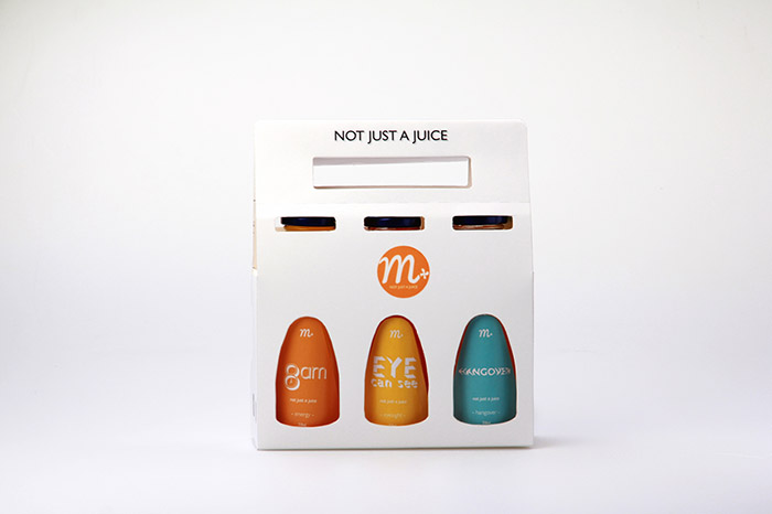
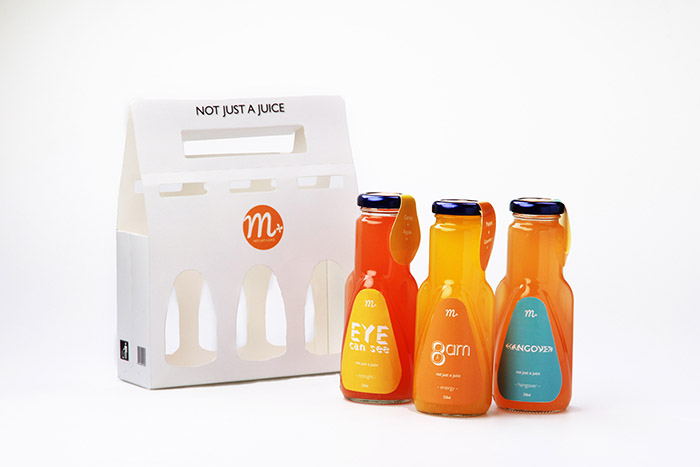
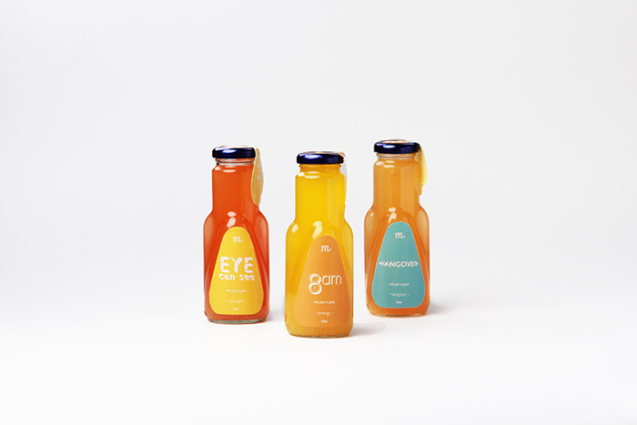
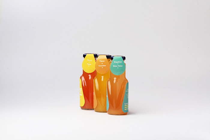
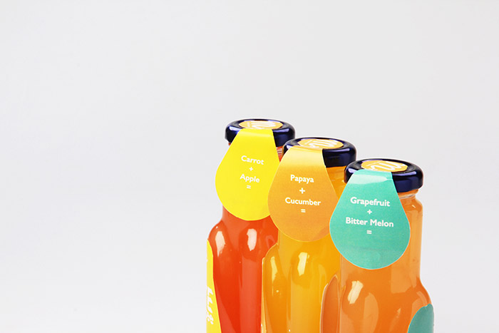
The idea of M+ (Multi+ Fruit) packaging design was using typography to design the label to show the product u.s.p. I wrote a tagline for M+, “Not just a juice” which telling the audience our fruit juice is just a normal fruit juice it’s come with additional benefits for customers.
Designed by: THE CLU, Malaysia.
Featured on Package Inspiration
We are young team which works to inspire packaging designers every day! Our team select the best packaging of today and shares with you.

 packaging design was using typography to design the label to show the product u.s.p. I wrote a tagline for M+, )