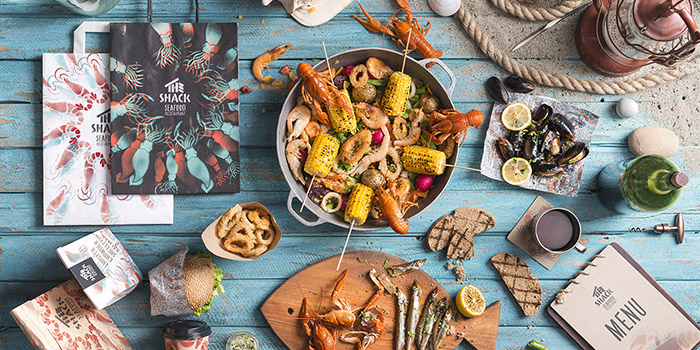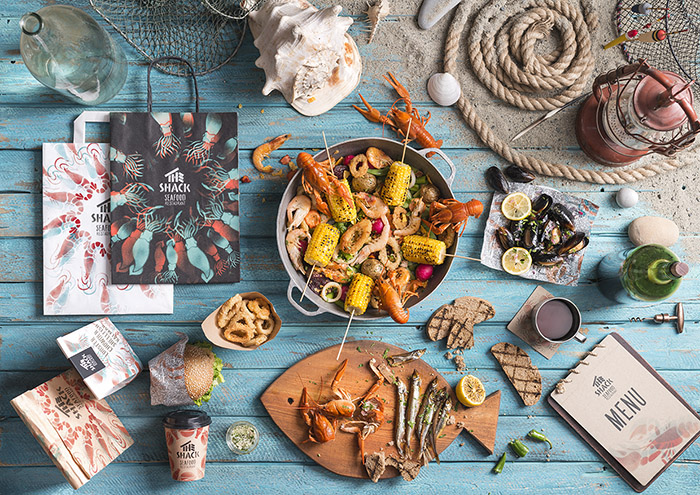
One of our working criteria is always make the brand visualization express an essence.
We celebrated the seafood eating culture in the shacks by telling you a story about one of them. The Shack means a small wooden fishing house. The logo construction visualizes the naming and its design recalls to a shack.
According to the concept, the owner, who is the fisherman, will entertain you to delicious fished wild seafood, wherein having just a small restaurant which is not that rich. He cannot afford expensive design and brand identity.
Supposing the fisherman’s limited opportunities, he would have just handy tools for making his restaurant identity. Even the materials used in the design talk about it.
He would carve out the stencil shapes of the fish he usually caught and the naming fonts by himself and make stenciled illustrations for his small restaurant design.
The zest of The Shack brand are the variations of the design compositions created by twisting the fragments and changing the colors of the illustrations.
The packages for the brand identity has two packaging categories: colored, as main and a fluorescent on black, as premium. The premium black package transfers the idea of the night sea. Blue and red were chosen as the main brand colors indicating deep sea and cooked seafood.
The Shack concludes the overall mood of the spirit of the sea and freshly fished seafood in each of its branding elements.
Credits
Client: Allied Brothers CO.
Brand Strategy: Matt Bartelsian
Art Direction/ Design: Stepan Azaryan
Design: Kristine Khlushyan, Lilit Arshakyan
Photography: Backbone Branding
Date: December 2015
Service: Branding, Packaging, Illustration
Category: Restaurant Branding
Designed by: Backbone Branding, Armenia.

Featured on Package Inspiration