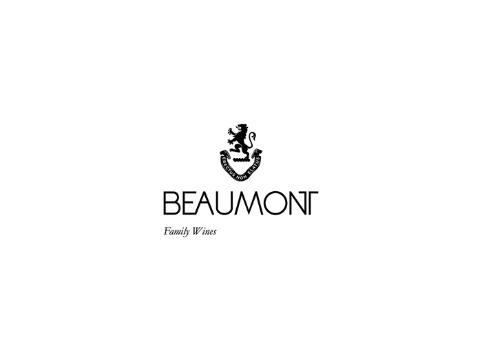
A new generation of Beaumont’s are now leading the family wine business. The branding needed to reflect a new era and a new generation in a way that paid homage to the past, reflects the present and inspires the future. The family crest was always used as the symbol in their branding and and is worn by each family member in a signate ring as one of many family traditions. The problem was that the crest on the logo used in their branding was the same in content, but different in styling to the one on the ring. Chosen as the authentic reference to the original Beaumont family crest, the ring was photographed, enlarged and redrawn. We believe this process brought the crest back to its former glory, refined and slightly improved. From this point on, the crest became the focus of the positioning and design as it symbolised the family, their history and their purpose. The typography was cleaned up and modernised retaining the very recognisable ligatures that help link the old branding with the new. In an attempt to match image with substance, the clean contemporary design now represents the classic, balanced and elegant wines that the family produce. The cotton paper, printed in black only and embossed, reflects the simple and humble farm aesthetic; an authentic Overberg working farm with white washed walls and black tinned roofs. We decided to take out all other special production techniques on packaging like the prominent gold foiling to further reflect the visual strategy. The label design was used as inspiration for all other brand expressions, the stationery, photography, the signage, the “newspaper’ brochure, tasting notes and website (www.beaumont.co.za).
Designed by: Whitespace Creative, South Africa.


Featured on Package Inspiration