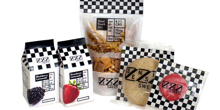
Sensi Sweets packaging needed to be high end, targeted towards adults, and stand out amongst its competitors. I decided to highlight the food and its ingredients in this process. I also brought a stark black and white checkered look to stand out amongs the brightly colored competitors. This would also give an honesty about the product by focusing on the food and making the information of its potency and nutrition facts readily available.
Sensi Sweets worked in collaboration with my Product and Packaing course. This is course work.
Designed by: Spencer Shores, USA.


Featured on Package Inspiration