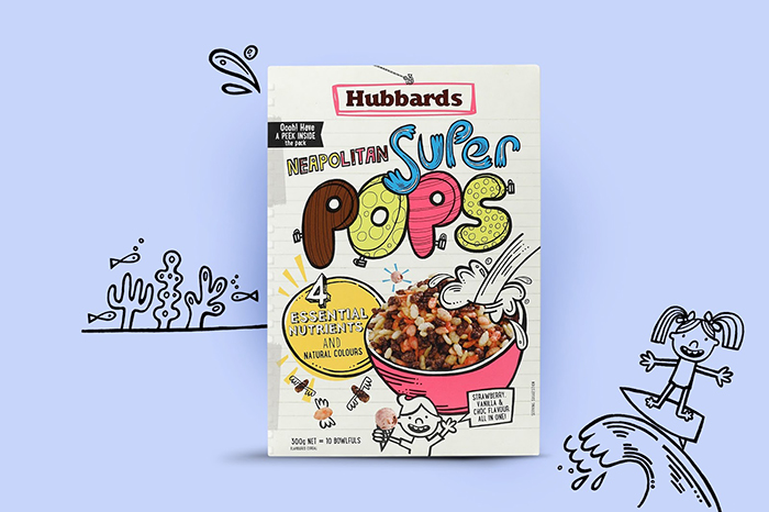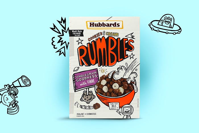
For the past year Coats Design has been redesigning the various ranges produced by Hubbards, introducing the new Brand created by Coats and repositioning each range to create maximum shelf appeal and unique tone-of-voice.
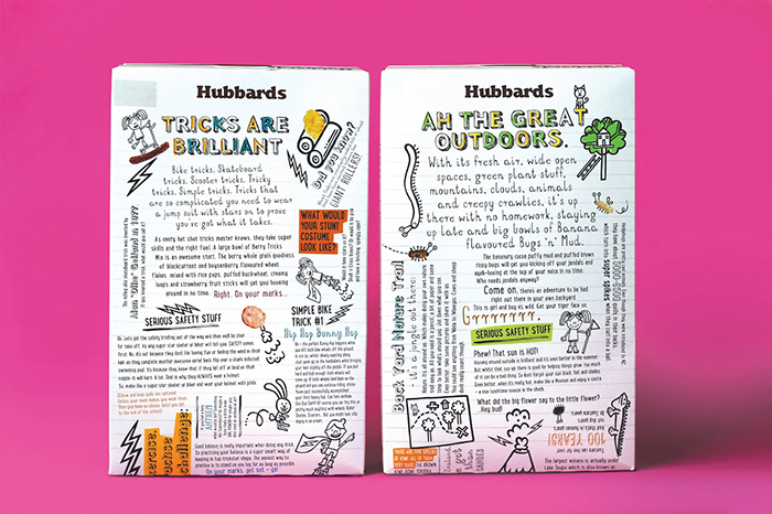
Hubbards Kids wanted to be different in the market. The new packaging direction has intentionally avoided the run of the mill cartoon characters and has been built around the emotive idea of kids doodles, sketch books and ‘mind farts’! In essence, each pack is a reflection of the chaotic, fun and random nature of kids’ minds.
Working with Beck Wheel from Watermark Ltd, a loose doodle style has been created, along with a load of lively stories and activities to entertain the kids (not forgetting the little kid in each parent). Even the inside of pack has been utilised, offering more fun and activities. An important feature of the rebrand was to engage the kids, get them reading or out of the house and having fun! The result, a completely unique cereal range that lives and breathes the new Hubbards brand.
Agency: Coats Design, New Zealand.
Designer: Matt Grantham
Illustration: Beck Wheeler
Client: Hubbards


Featured on Package Inspiration