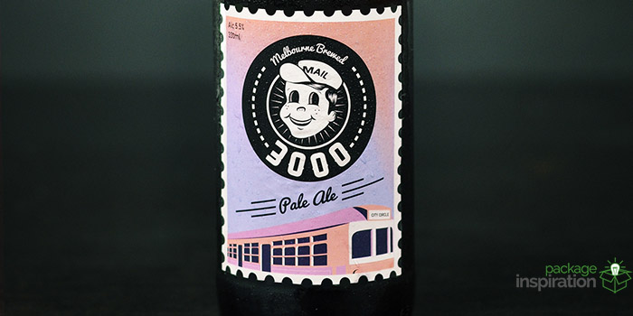
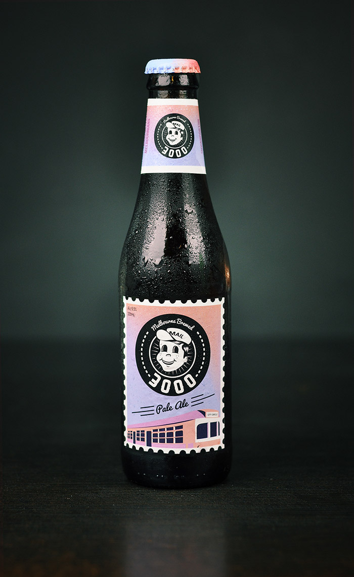
Beginning with the name, i wanted my product to be easily distinguished from other Melbourne craft beers. I chose 3000 as the name, directly corresponding to the Melbourne postcode and therefore keeping it exclusively Melbourne local. The audience i decided to target was young adults 18-25 and this very much influenced the final visual style. I went with a postal theme to link back to the name again. I also wanted to tap in to how in such a contemporary city; many people cling onto retro styles. Hence my design carries a fairly 1950’s creepy/retro visual style. I also wanted to make the front and back label look as though they were post stamps to link back to the name. After researching post stamps i realised most featured iconic imagery and landmarks. This resulted in placing a Melbourne tram into the label, while keeping the same colour scheme. The reason for my choice in colour scheme was purely to stand out against competitors. It was clear that most other craft beers had fairly rustic and natural colours. So instead i went for a consistent aesthetic and refreshing gradient throughout my design.
Designed by: billy gibney, Australia.

Featured on Package Inspiration
We are young team which works to inspire packaging designers every day! Our team select the best packaging of today and shares with you.
